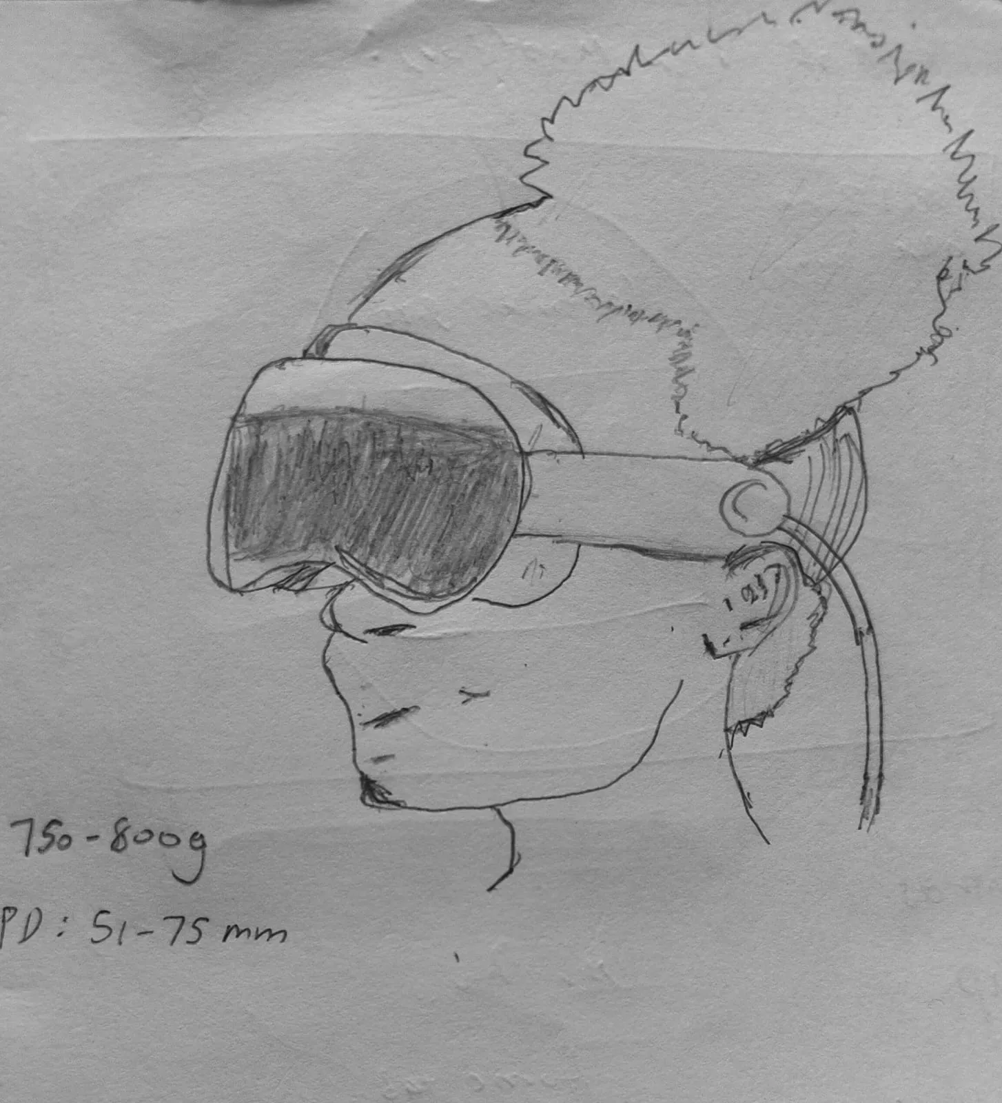
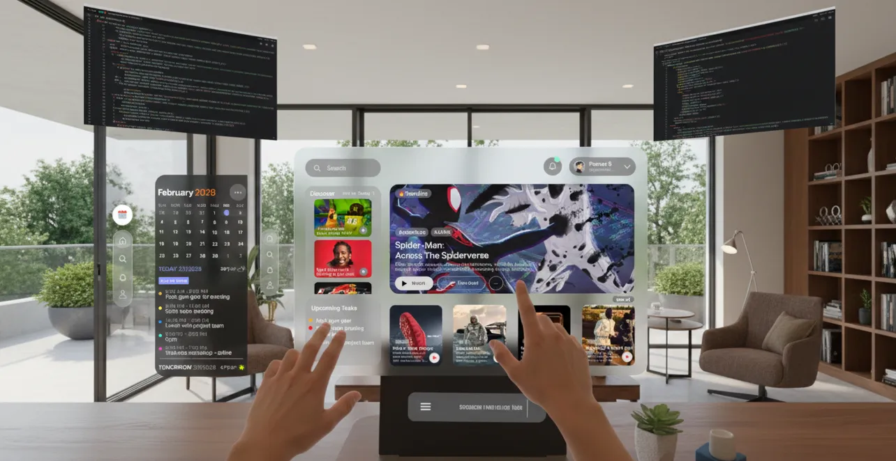
Most productivity apps feel cramped on a phone and lost on a desktop. With the Vision Pro, I had a literal room to work with. My goal was to port a standard Home and Calendar setup into a spatial environment, focusing on how to keep high-density information legible without overwhelming the user or cluttering their actual living room.
Target users are people who want to see their day and tasks at a glance without relying on physical notes or phones. The interface should be easy to read and interact with, but not get in the way.
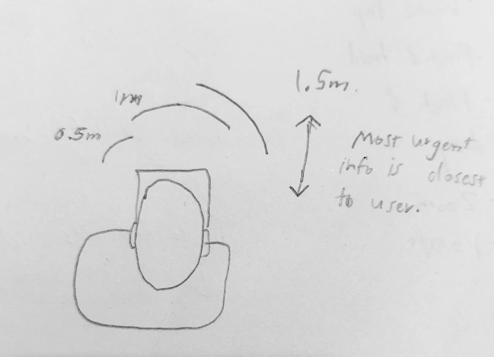
I explored the forward-facing field of view to decide where information should appear around the user. Urgent content is placed closer to the user, while secondary information sits further back. This helps reduce head movement and keeps interaction comfortable over time.
 Forward field-of-view mapping
 Top-down depth placement diagram
To make the UI clear and easy to use, every design decision was anchored to Apple's spatial computing guidelines.
System white with variable opacity. Text must remain legible at arm's length without requiring users to shift focus from their environment.
At least 60pt × 60pt for pinch and gaze accuracy. Undersized targets cause missed taps and frustration in extended use.
Menus appear 20pt below main windows to feel physically attached, giving users a consistent mental model for where secondary actions live.
Glass-like surfaces with subtle inner borders to show depth. Background blurs and floor shadows anchor windows to the user's real space.
Common gestures were mapped to task actions, ensuring every interaction felt intuitive and physically grounded.
| Gesture | Action Type | Example |
|---|---|---|
| Tap | Immediate state change | Mark task done, select calendar date |
| Double Tap | Drill down | Expand task to see sub-tasks and notes |
| Pinch & Hold | Secondary action | Open quick menu |
| Pinch & Drag | Move items | Reorder tasks or drag into calendar |
| Zoom | Switch scope | Day → week → month view |
| Rotate | Window angle | Adjust interface to fit user posture |
The project started with a wireframe overview to plan the layout for both Home and Calendar screens. This helped establish spacing, depth, and placement of key elements before creating the final UI.
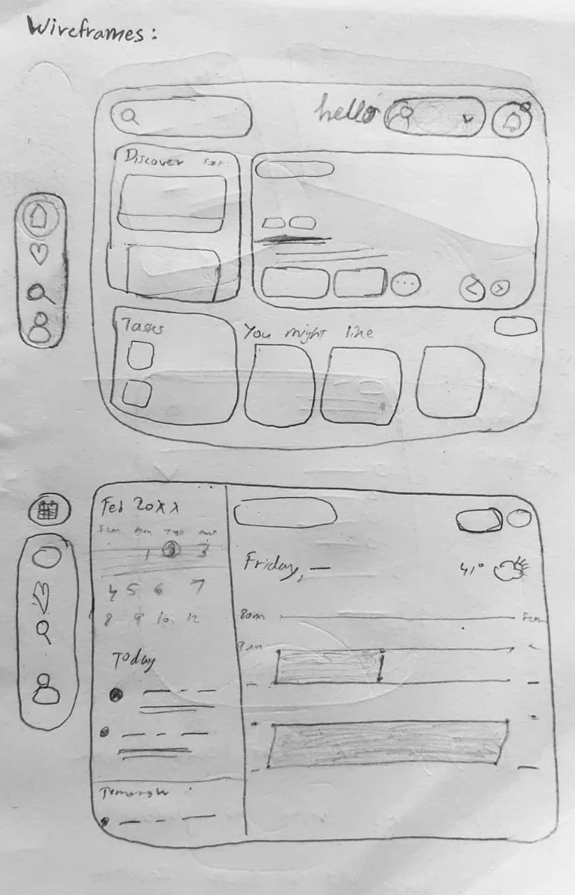
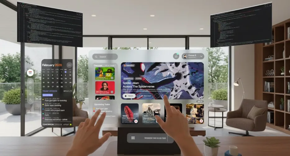
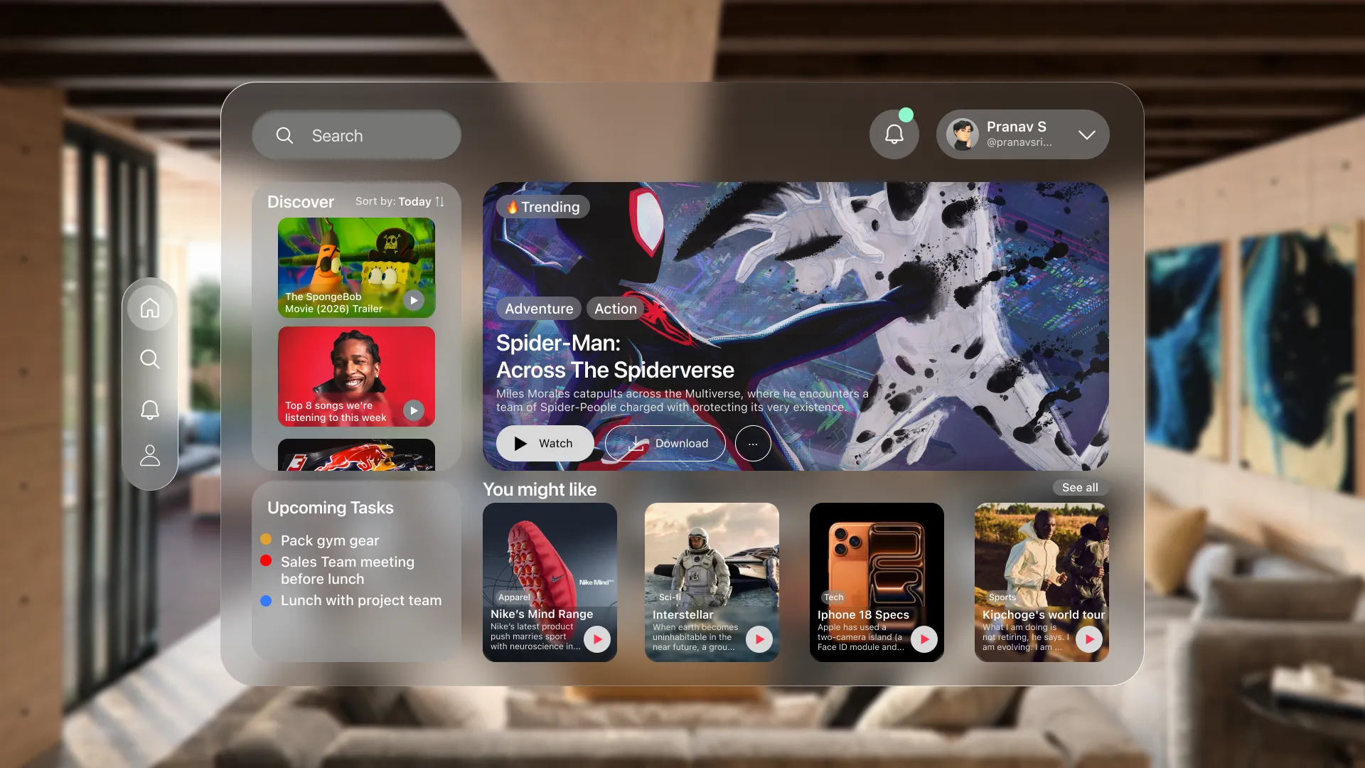
The Home screen shows glanceable tasks alongside recommended articles, what's trending, weather, and discovery content. I wanted the UI to feel like a ghost — there when you need it, invisible when you don't.
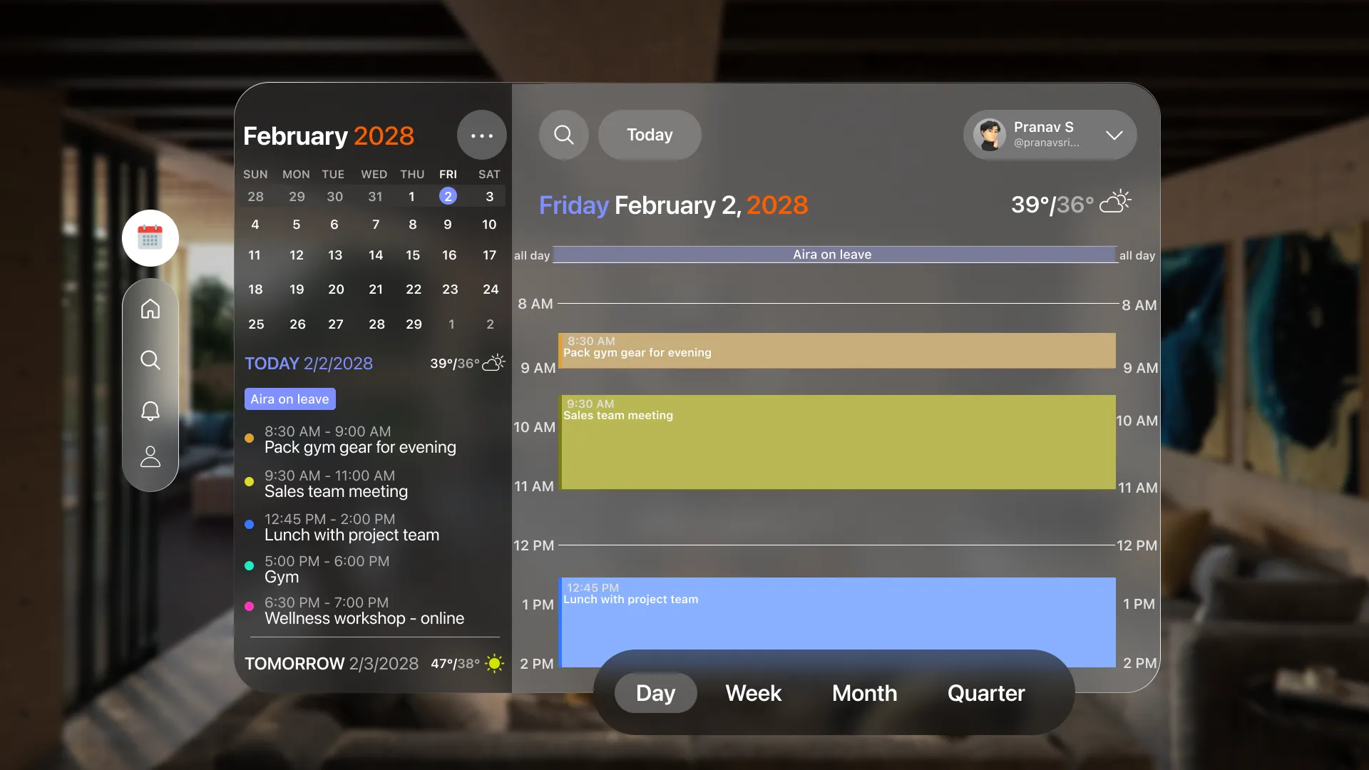
The Calendar screen displays today's tasks along a timeline. The background dims to keep focus on the tasks. Users can switch between day, week, month and quarter view — not just by zooming in and out of the calendar but also through the menu at the bottom.
The tasks panel can stay open alongside other apps. Users can check their tasks while interacting with multiple screens. This reduces switching and keeps important information visible in the periphery.
On mobile, to-do lists are hidden, but in XR, "always on" can become "always distracting." I learned to treat UI as architecture, placing elements where they are accessible when needed, but peripheral enough to avoid cluttering the user's focus.
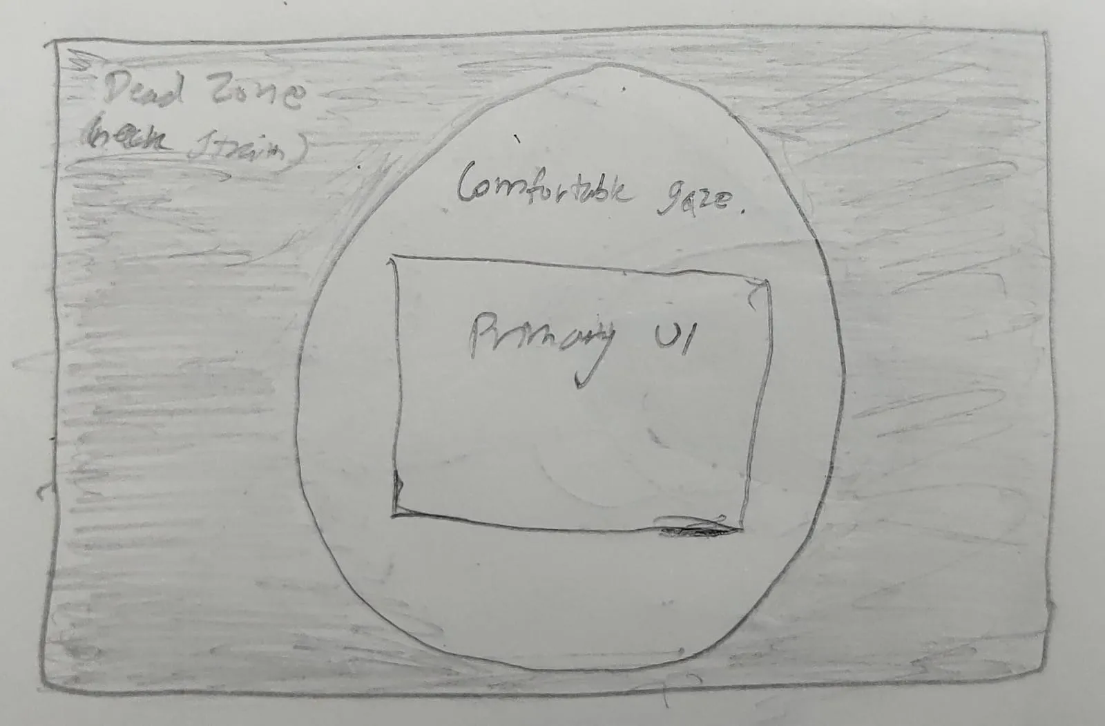
Designing for Vision Pro taught me that beautiful UI is useless if it causes neck strain. I prioritized comfort by mapping a safe 60-degree FOV, ensuring physical well-being is at the core of the spatial interface.
In 2D, we use bold text to show what's important. In 3D, I used distance. I pulled urgent tasks closer to the user on the Z axis, making them larger and easier to grab, while pushing the calendar back to act as a background reference.
Digital windows can feel unstable if they don't interact with the real world. By adding subtle background blurs, inner lighting borders, and shadows on the floor, I made the interface feel anchored and trustworthy in the user's space.