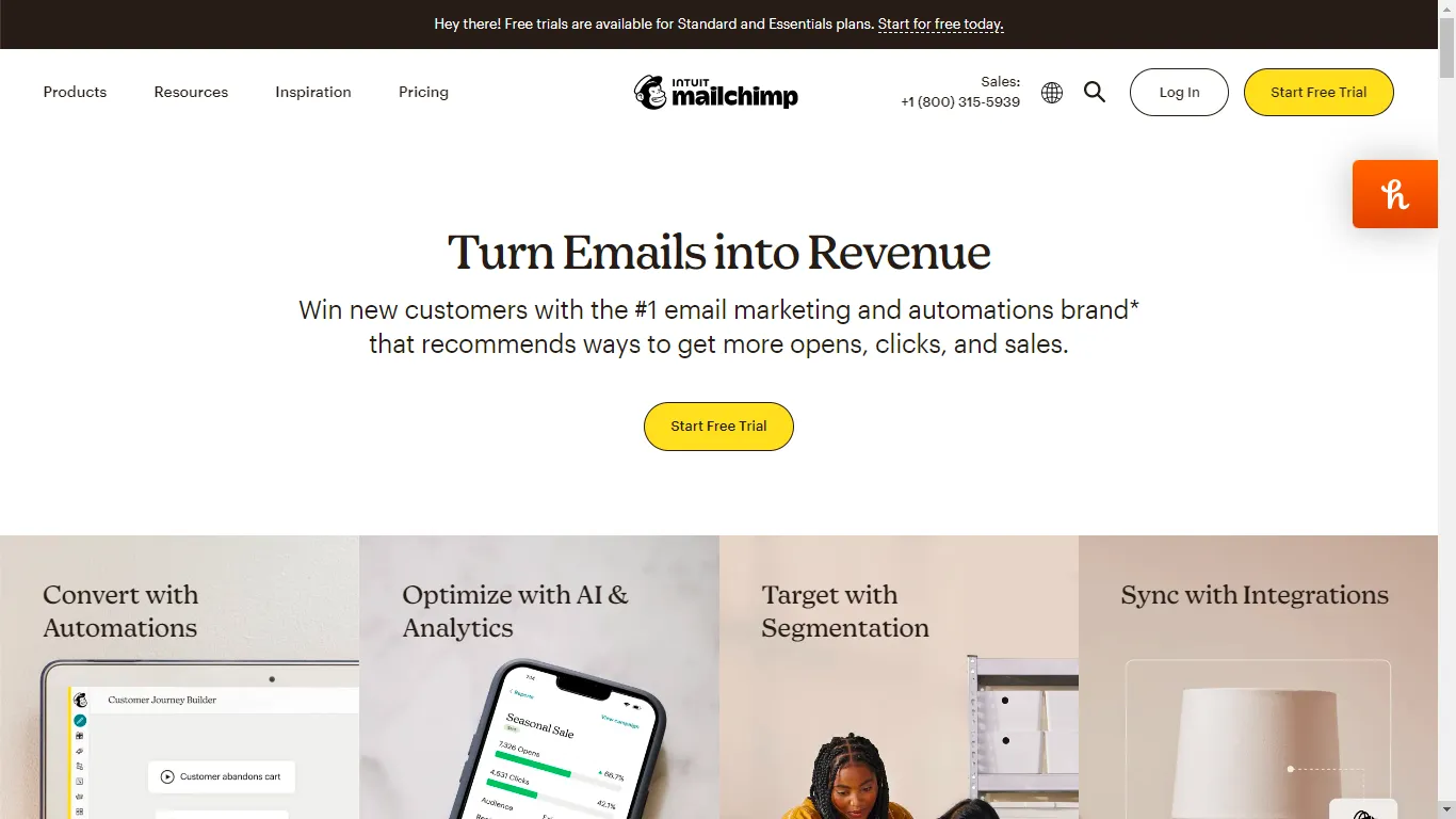
Mailchimp is a widely used marketing automation platform, best known for its email marketing tools for small businesses. It allows users to design, send, and track campaigns, and is often considered an industry standard in the email marketing SaaS space.
I noticed that even though Mailchimp is an industry giant, their pricing page felt like a hurdle rather than a help. I wanted to see if I could take that massive list of features and turn it into a decision-making tool that actually made sense for a growing business.

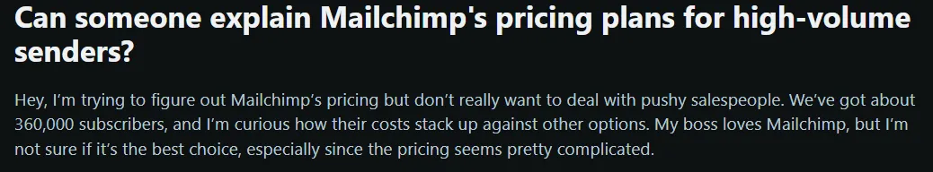


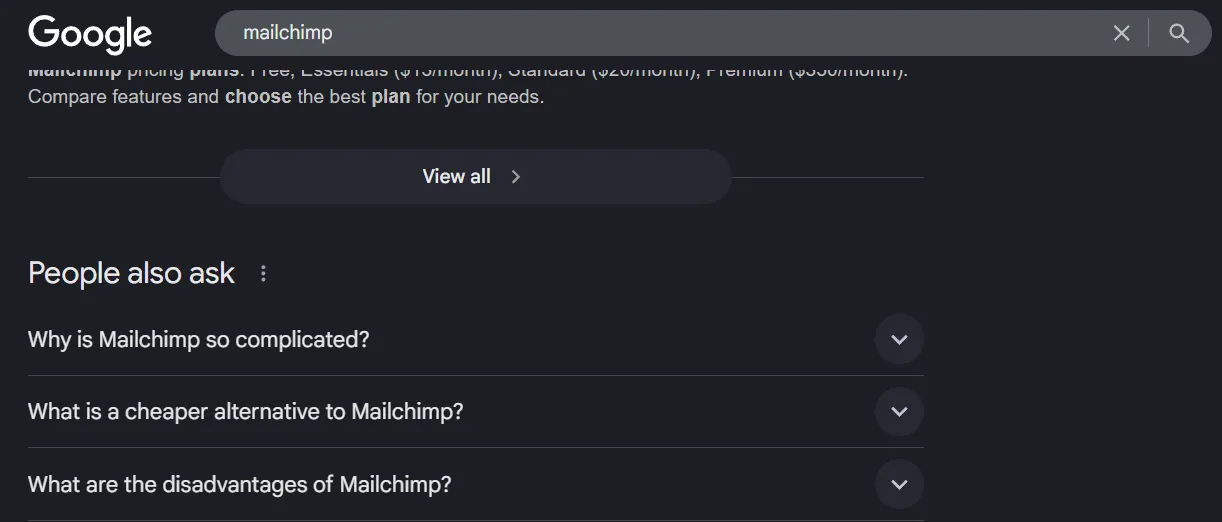
I scoured Reddit threads, forums and related search queries to understand and look for patterns in how real users discussed Mailchimp's billing. What I found was that users were forced to reverse-engineer pricing instead of being guided toward a decision. There was no strong value anchoring to convince users of the price point, and experienced users still needed the community to understand cost implications.
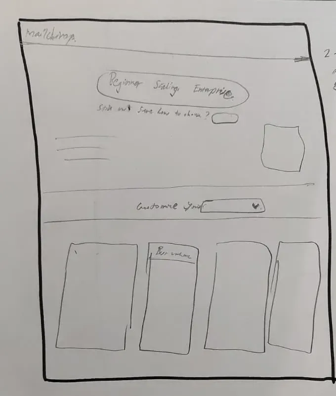
Its pricing page does not help users answer the most basic question: "How much will this cost me as I grow?"
Growing small businesses and early-stage marketing teams, with:
Increase conversion to the mid-tier Standard plan by reducing decision friction and strengthening value anchoring.
Secondary goalsReduce bounce on the pricing page, reduce reliance on the "Find my plan" quiz, and increase confidence at the point of CTA.
With the primary user and conversion goals defined, I performed an audit of the existing pricing page to identify UI-level friction contributing to decision paralysis. Pain points were later grouped to identify similar patterns.
Mapping the user's emotional journey through the existing pricing page revealed exactly where and why decisions stall.
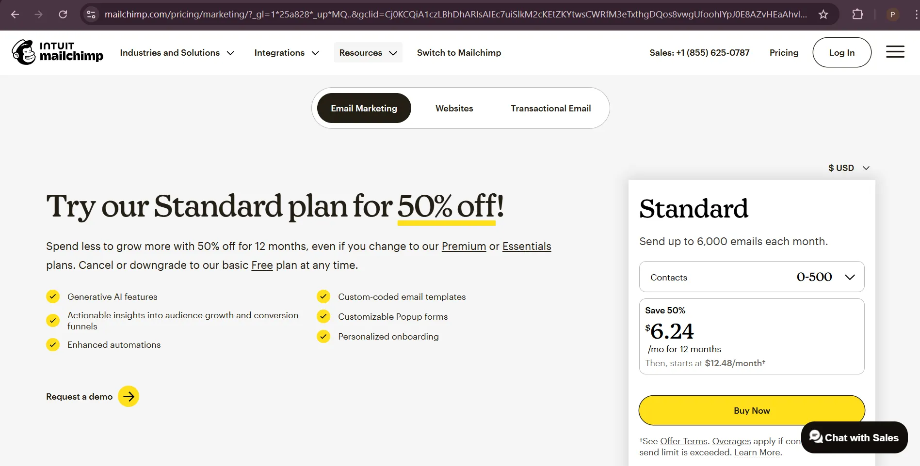
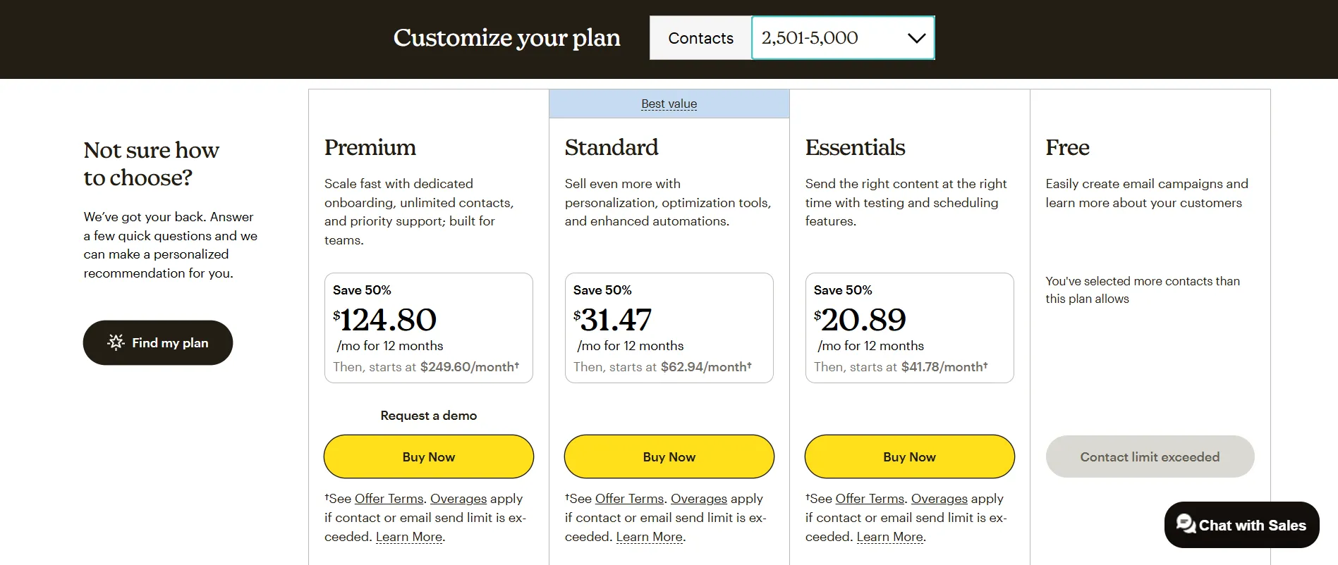
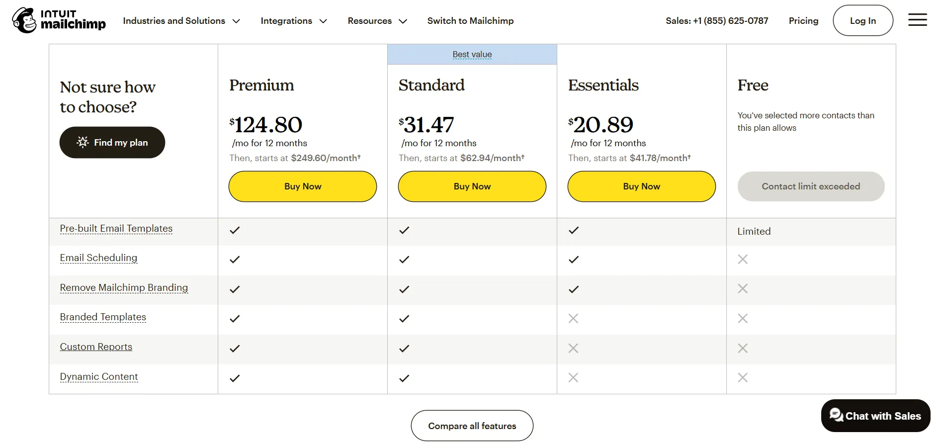
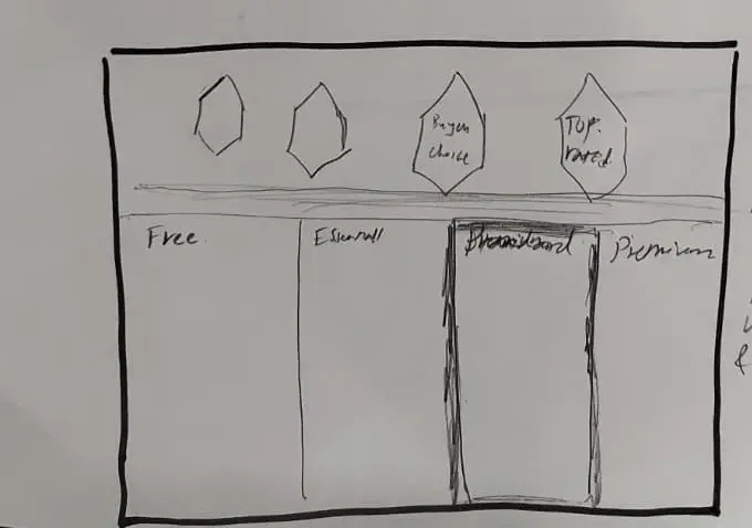
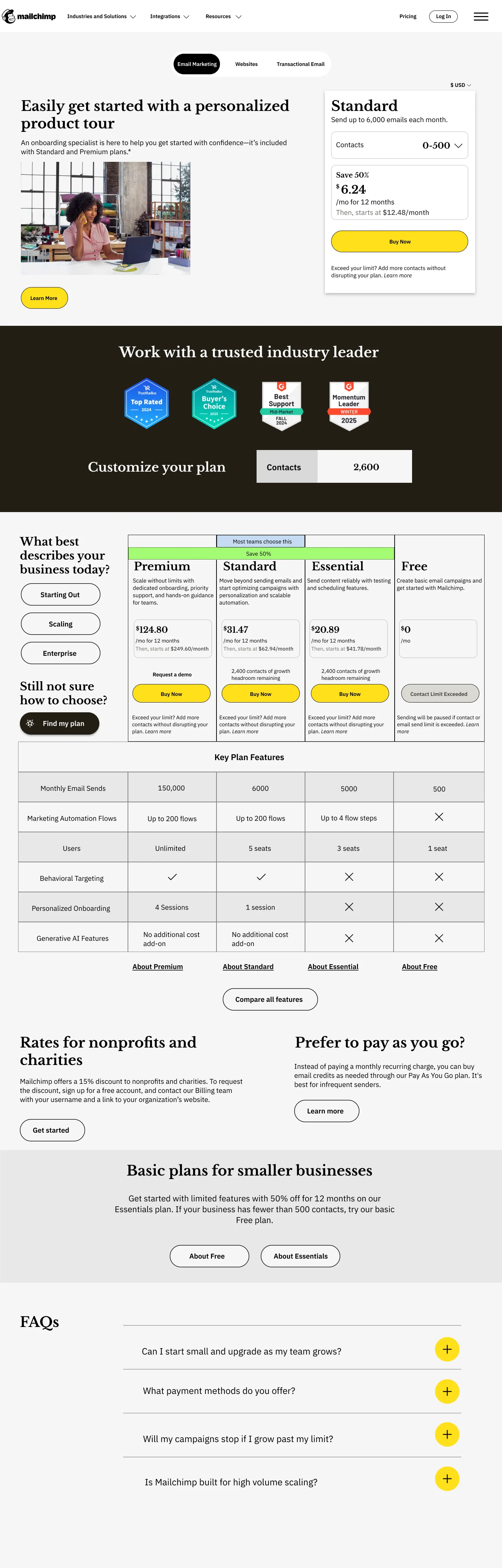
Instead of tech specs, I framed plans around business milestones: Essentials for "starting," Standard for "scaling," and Premium for "optimizing." Placing the premium plan as a visual anchor makes Standard feel like a bargain.
I shifted the focus of the Essentials plan to be transitional. By limiting high-growth tools but keeping the price close to Standard, the value gap becomes obvious and nudges users toward the mid-tier.
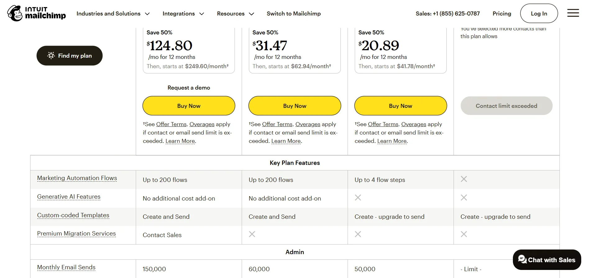
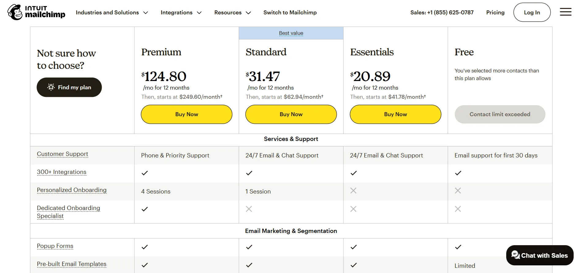
I surfaced only the winning differences upfront. Detailed technical specs were moved into expandable sections to satisfy power users without overwhelming skimmers, highlighting actual reasons to upgrade.
I used dynamic messaging to turn paying for unused contacts into room to grow. This changes the perception from overpaying to having a stable, scale-ready foundation.
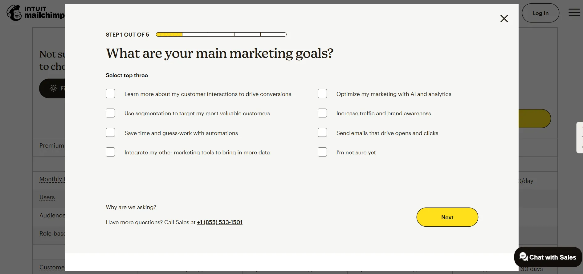
Clicking a persona gives users a sense of progress, increasing the likelihood of completing the CTA. This reduces the interaction cost associated with finding the right plan.
I brought overage explanations out of the fine print and onto the main stage. Moving trust signals near CTAs builds the trust necessary to reassure users at the decision point.
My biggest hurdle was the feature list. I was struggling to give skimmers the speed they wanted without leaving detail-oriented skeptics in the dark. I eventually decided that winning differences must be the only thing visible at first glance, with everything else progressively disclosed.
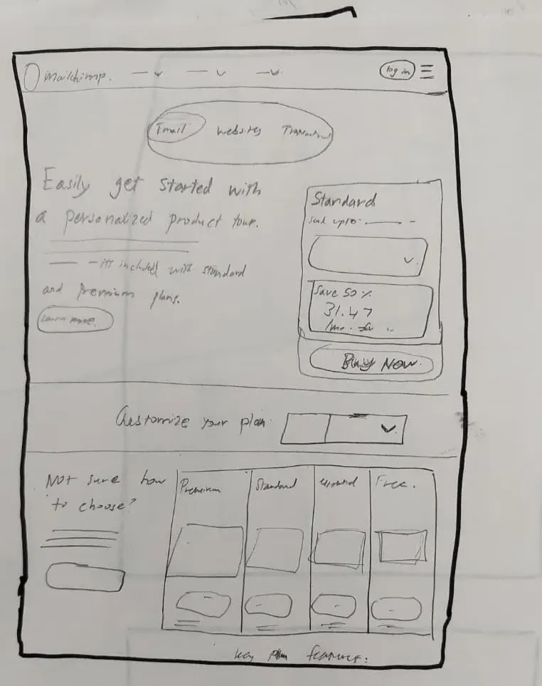
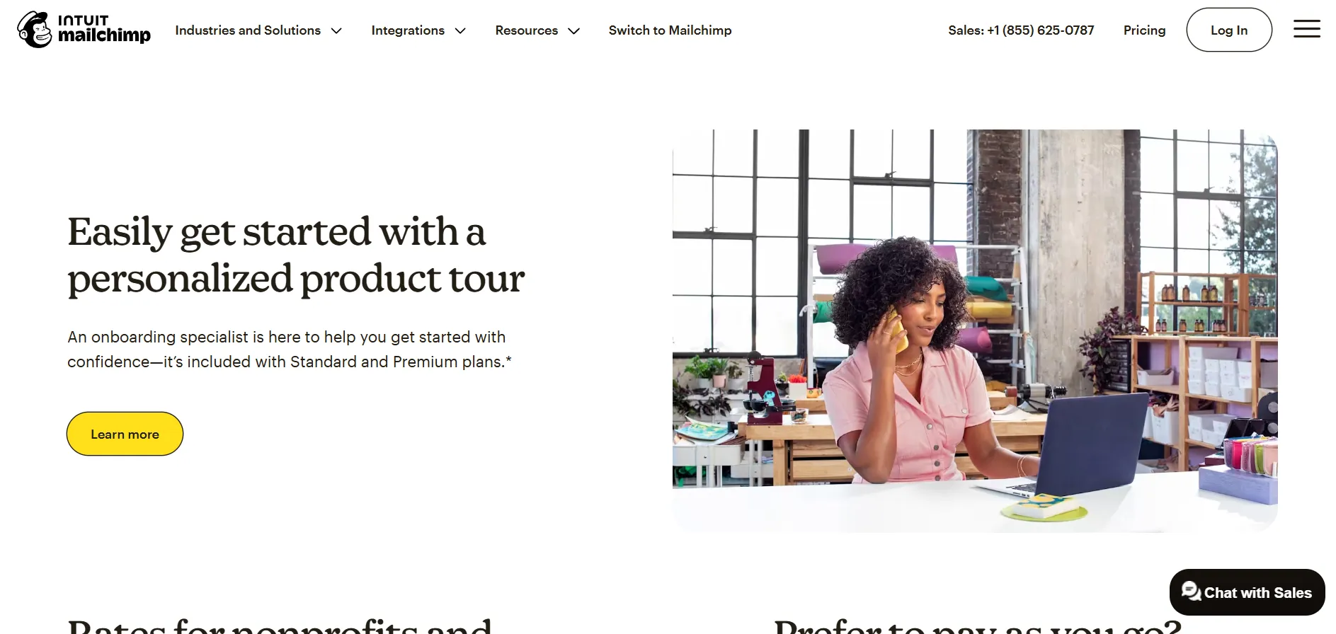
Moved the personalized product tour message to the hero section, so it lets users know and naturally points them to the Standard plan beside it.
Added choice architecture beside the "Find My Plan" button to make users feel 20% done before they've even started — triggering the goal gradient effect.
Shifted trust tokens and social proof near high CTA areas at the top, so confidence-building content appears at the exact moment users are deciding.
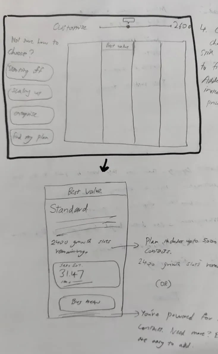
Removed staircase pricing and let users enter their preferred contact count naturally. Rephrased the copy so users feel they have room to scale rather than paying for wasted capacity.
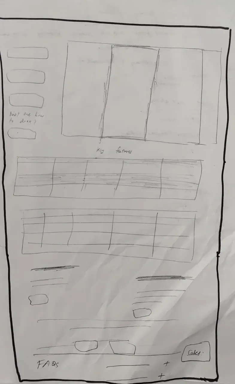
Curated the feature list to only surface what directly pushes users toward Standard, with all remaining features tucked behind a "Compare all features" toggle for power users.
The 50% discount was a great hook, but it couldn't convert users who were fundamentally confused by the pricing logic. I learned that urgency only works if the value is clear first.
I realized that some users need technical details to feel safe, so I couldn't just remove them. The solution was progressive disclosure — showing the most important info first and keeping the deep details one click away.
Users aren't just worried about the cost; they're afraid of outgrowing the plan or the system breaking. By showing that their business never stops during a switch, I gave them a safety net that made upgrading feel less risky.