SoundCloud built its reputation as the underground home for emerging artists and dedicated music hunters. But over time, it has drifted toward a cluttered, corporate experience that buries the music under ads, metrics, and social noise. This project reimagines SoundCloud from the ground up — not as a streaming app, but as a digital record store: a space where discovery feels physical, personal, and worth the hunt.
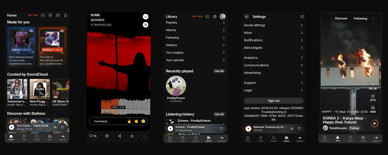 Current SoundCloud Interface
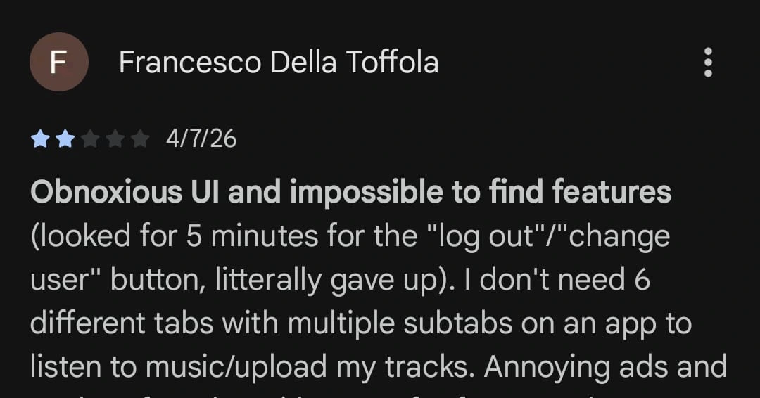
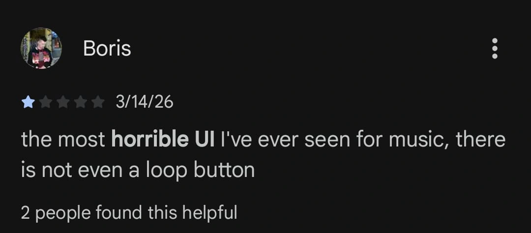
Using InspoAI's Brand Scanner, I deconstructed the existing interface to trace where the visual noise originates. The scan revealed a platform trying to be a social network, a streaming service, and an ad billboard all at once. This identity crisis creates a high-friction environment where the artist's brand is consistently buried by corporate UI elements.
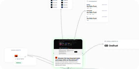 InspoAI Brand Scanner output
To reclaim SoundCloud's soul, I reimagined the platform as an Underground Record Store. This shifts the paradigm away from the social media scroll and toward a tactile, physical experience — treating every track as a rare artifact rather than a digital file, and restoring the emotional weight of discovery.
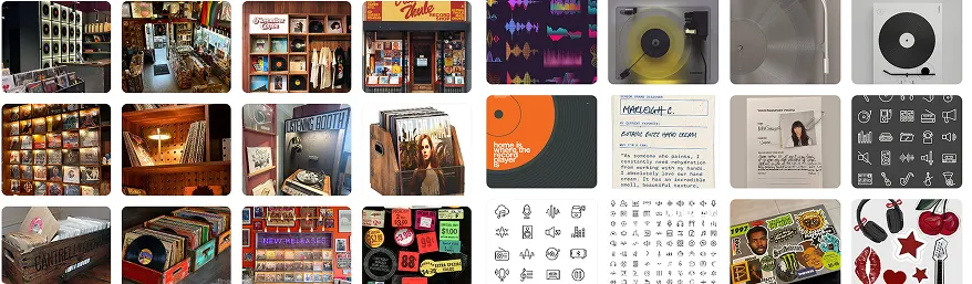 Concept Moodboard
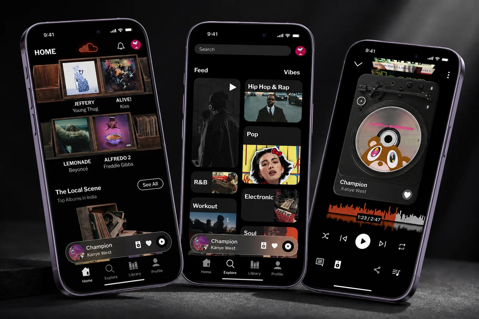
Wood-paneled shelving and tactile layouts treat albums as tangible artifacts, not flat thumbnails.
The SoundCloud logo rendered in glowing amber neon, replicating the vibrant energy of a storefront sign.
Staff Picks use mixed-media icons — polaroids, paperclips, vinyl — to signal hand-selected recommendations over algorithm.
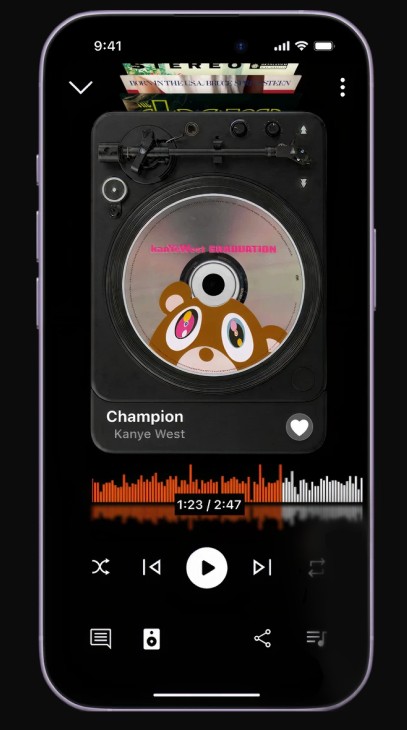
A currently-playing screen built like a high-end turntable setup, giving artists' work the atmosphere it deserves.
Rather than designing for generic users, I anchored the concept around two specific personas who define the underground scene.
The person who walks in not knowing what they want, but knowing exactly how they want to find it. They're not looking for hits — they're after hidden gems, and they want a space that rewards their curiosity.
The creator who treats their music like a physical masterpiece, not a digital file. They don't just want to upload — they want to display their work in a space that feels premium, authentic, and gives them a dedicated corner to host their fans.
The new Information Architecture replaces the cluttered social-feed model with four distinct pillars, ensuring the user is never more than two taps from their destination.
Designed for high-curation discovery. Prioritizes "Front Rack" and "Staff Picks" — like walking into a store where the trending and curated work is already on display.
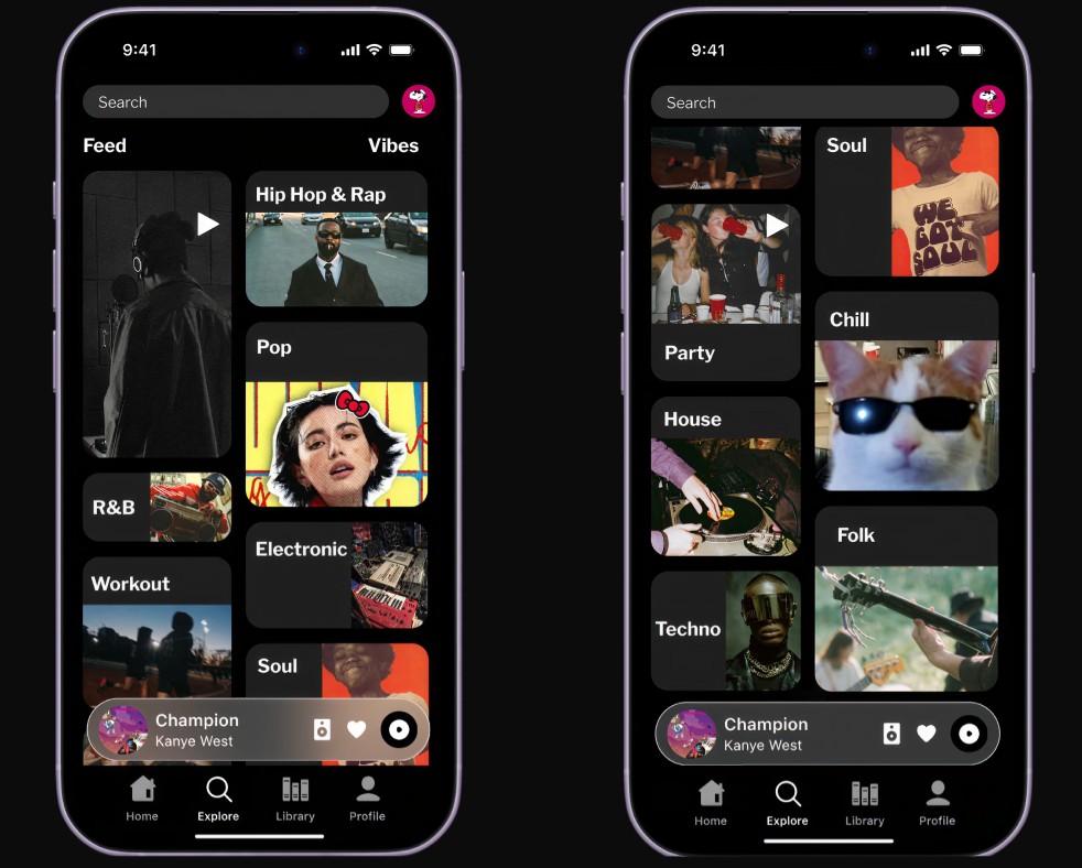
Consolidates Feed and Vibes (genres) into one screen, eliminating navigation layers and restoring the natural flow of discovery with a bento-style tactile layout.
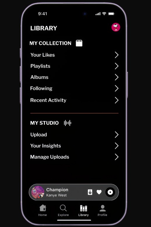
Divided into "My Collection" and "My Studio" — a listener's personal crate on one side, and a full artist upload and insights suite on the other.
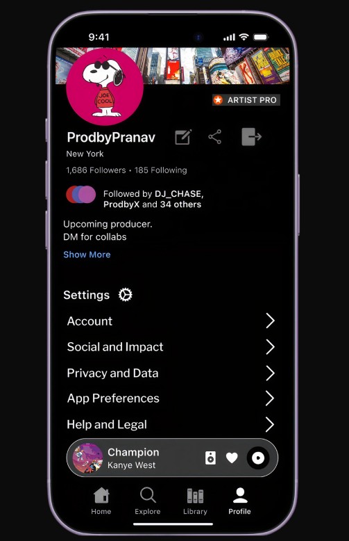
A centralized hub for personalization and settings. Administrative tasks pulled into one column so the rest of the UI stays focused entirely on the music.
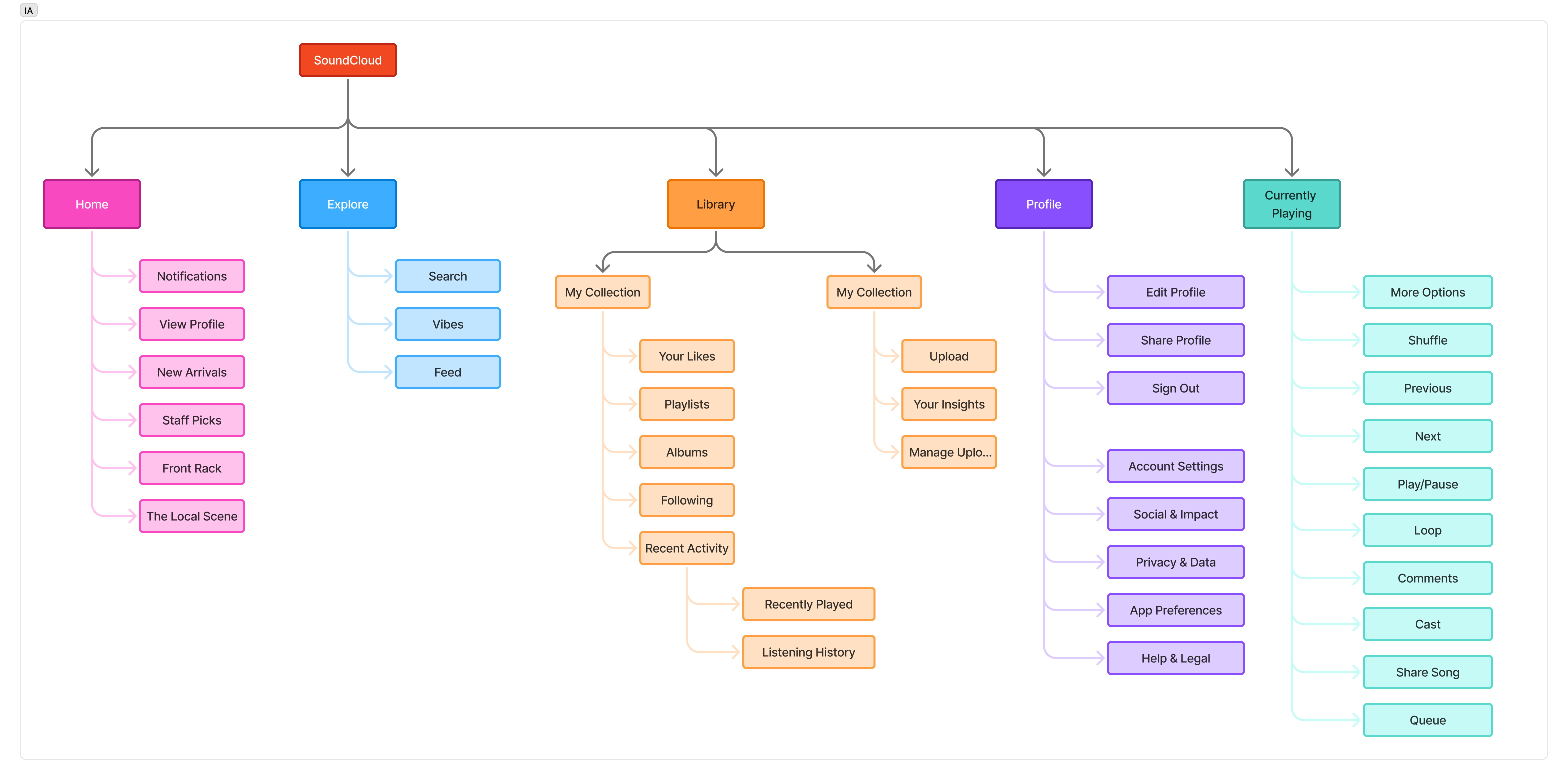 Information Architecture — four-pillar navigation model
The type pairing deliberately bridges the gap between vintage hardware and modern software.
Primary headers. Evokes the bold, stamped authority of industrial label makers and vintage record sleeves. Provides the analog soul.
All metadata and functional text. Its precision ensures maximum legibility and a seamless digital flow without competing with the analog aesthetic.
Moves from a passive social feed to a tactile, structured discovery experience. New Arrivals shows tracks from followed artists, Staff Picks replicates handwritten record store recommendations, and Front Rack surfaces what's hot right now — displayed on wood-paneled virtual shelves.
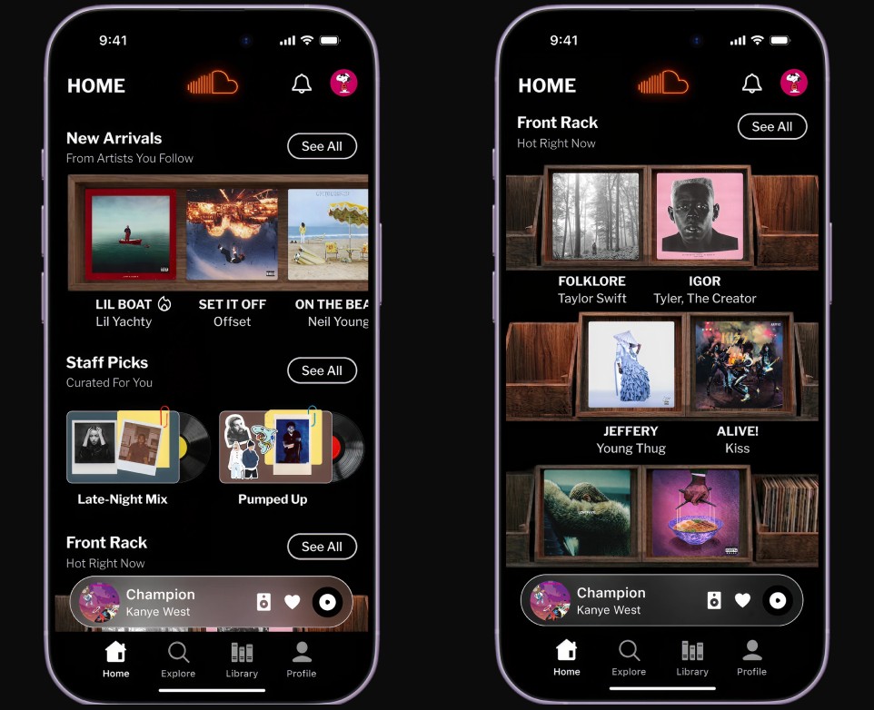
Acts as a unified hub, consolidating Feed and Vibes into one screen. The bento-style genre layout makes browsing feel like flipping through record bins — each genre tile is a tactile entry point, not a flat list item.
Reimagined as a dual-purpose space mirroring a record store's back-of-house. My Collection functions as a digital crate. My Studio below the divider gives artists a dedicated upload and insights suite — no more burying these tools inside settings.
By pulling administrative settings into a primary pillar, the Profile hub centralizes user identity and eliminates navigational friction — surfacing quick actions for editing and sharing, simplifying the log-out flow, and ensuring the library remains a focused space for listening and creation.
The emotional heart of the redesign — built like a high-end turntable setup. A rotating vinyl disk reflects the current track's artwork, stacked records at the top hint at the queue without opening it, and the waveform scrubber sits below in SoundCloud's signature orange.
The record store metaphor wasn't just a visual skin — it became a decision-making framework. Every time a design choice came up, I could ask "does this feel like something you'd find in a record store?" and get a clear answer.
Mapping out the information architecture before opening Figma was the best decision I made. Every layout choice — like the Explore consolidation or the Library split — came from those user flows, not just from trying to make things look good. The logic made the design feel earned rather than forced.
Working within a sprint taught me that constraints are actually a superpower. Instead of being overwhelmed by the entire SoundCloud ecosystem, the hackathon deadline forced me to isolate the core friction points, resulting in a tighter, more focused redesign than if I had an unlimited timeline.
I learned that UI isn't just about utility; it's about protecting the brand's soul. When you strip away the generic corporate layers, you aren't just making the app "cleaner" — you are actively building an atmosphere that invites the user to stay longer and dig deeper.