A redesign of the SaaS pricing experience

Mailchimp is a widely used marketing automation platform, best known for its email marketing tools for small
businesses. It allows users to design, send, and track campaigns, and is often considered an industry standard
in the email marketing SaaS space.
I noticed that even though Mailchimp is an industry giant, their pricing page felt like a hurdle rather than a help. I wanted to see if I could take that massive list of features and turn it into a decision-making tool that actually made sense for a growing business.
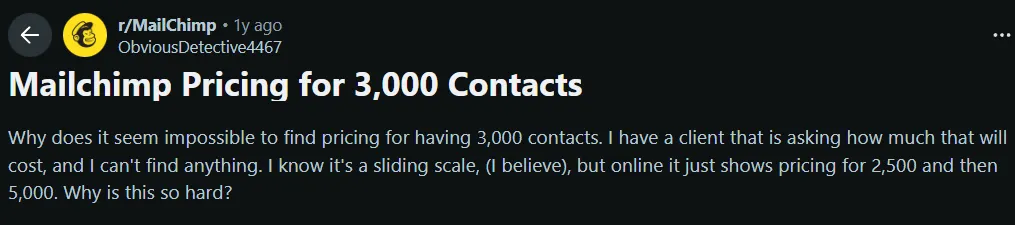


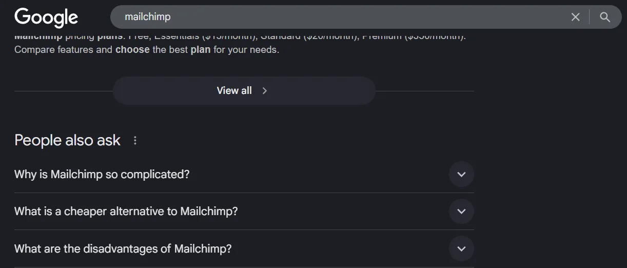
I scoured Reddit threads, forums and related search queries to understand and look for patterns in how real users discussed Mailchimp's billing. What I found out was that users were forced to reverse-engineer pricing instead of being guided toward a decision. There was also no strong value anchoring to convince the users of the price point and experienced users still needed the community to understand cost implications.
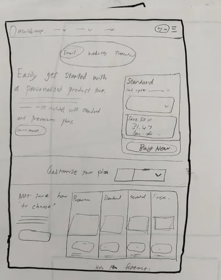
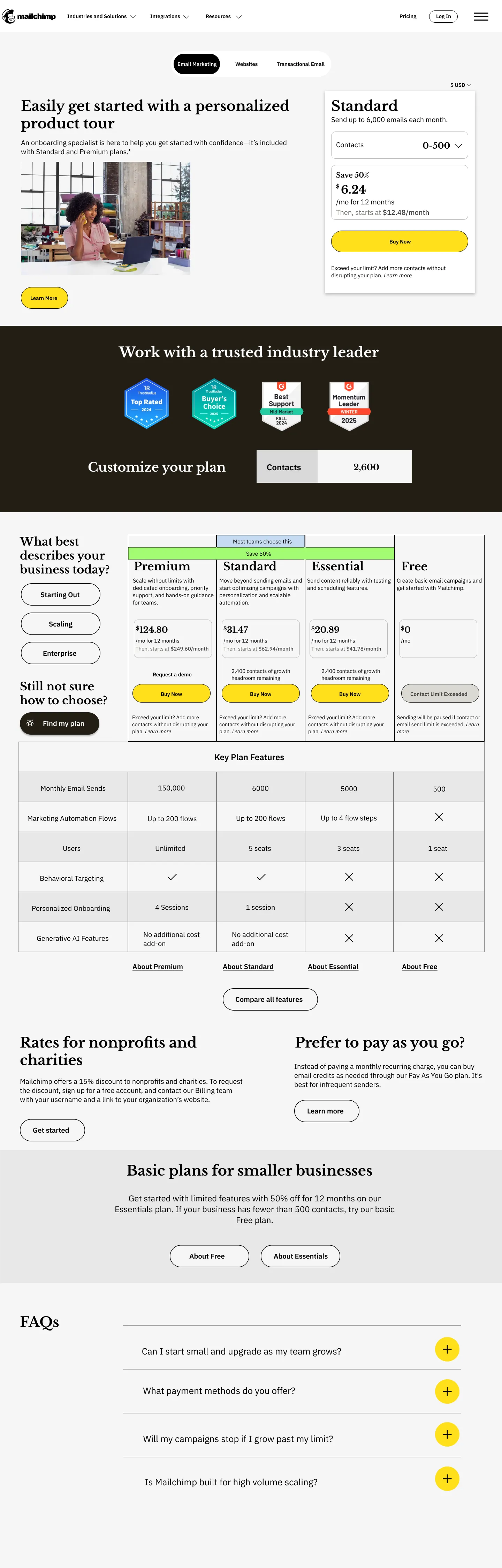
Its pricing page does not help users answer the most basic question: “How much will this cost me as I grow?”
Why this segment?
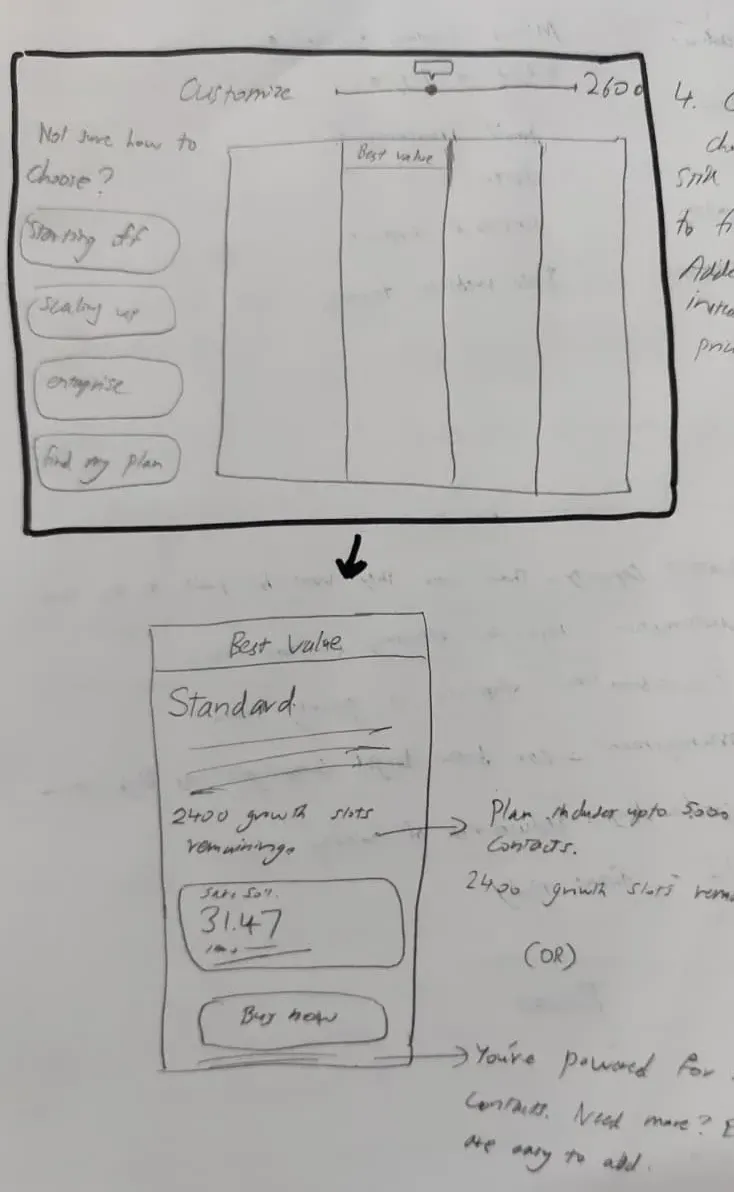
Primary conversion goal: Increase conversion to the mid-tier plan (Standard) by reducing decision friction and strengthening value anchoring.
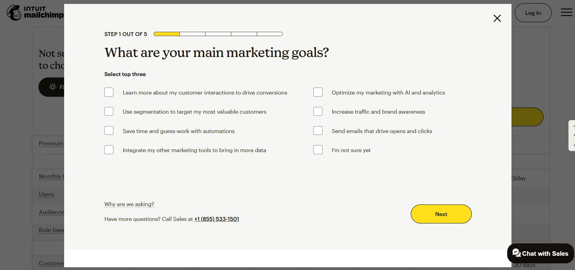
Secondary goals: Reduce bounce on the pricing page, reduce reliance on the “Find my plan” quiz, and increase confidence at the point of CTA.
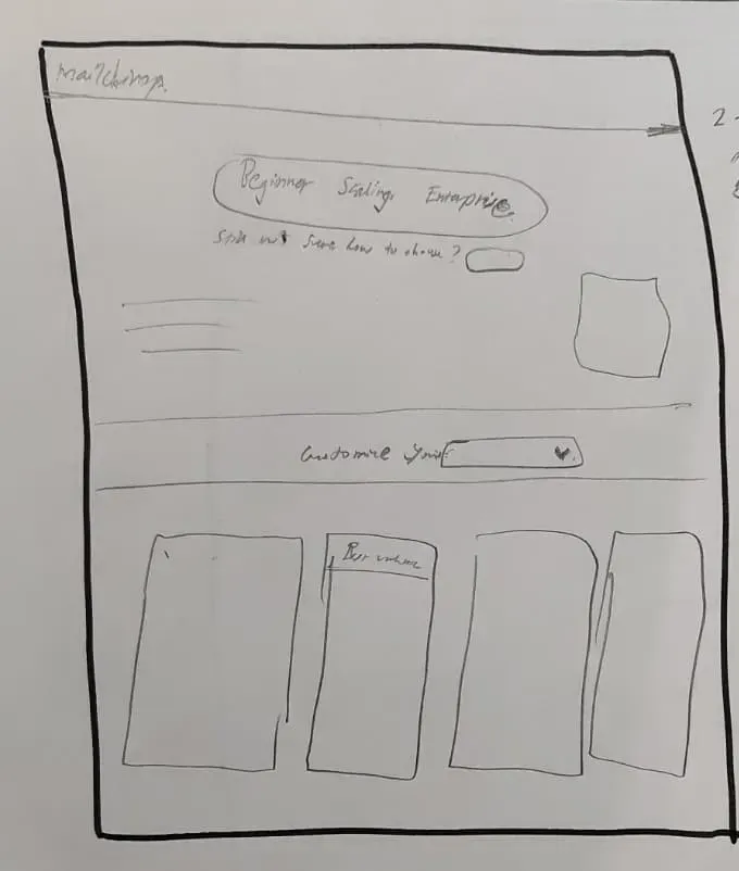
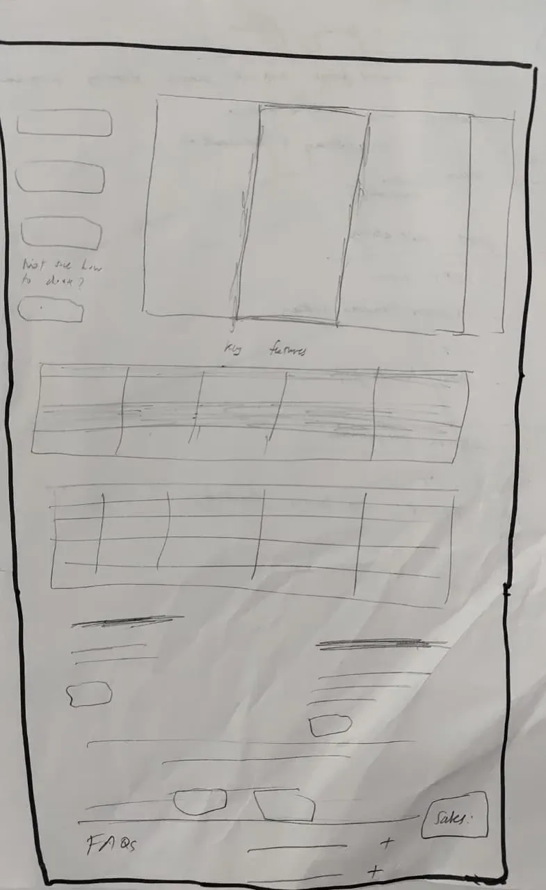
With the primary user and conversion goals defined, I performed an audit of the existing pricing page to identify UI-level friction contributing to decision paralysis. The pain points I identified were later grouped together to identify similar patterns.
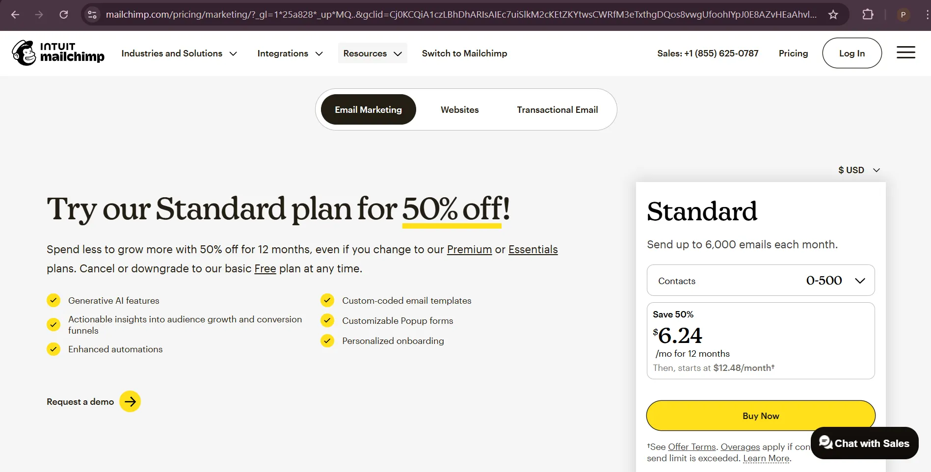
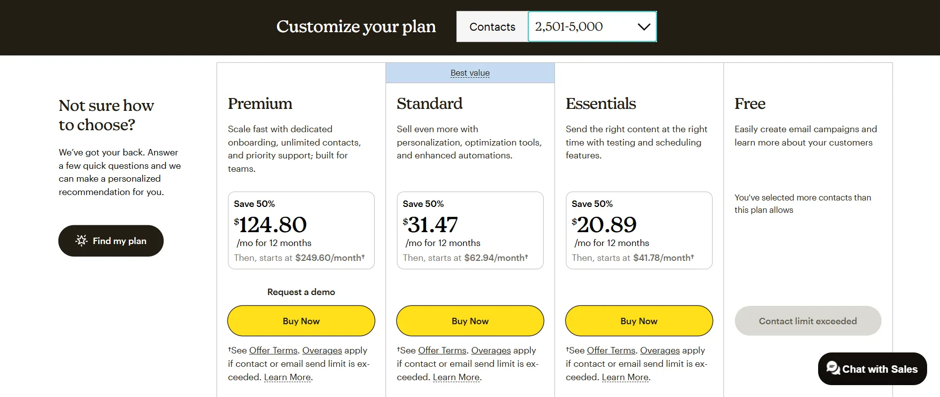
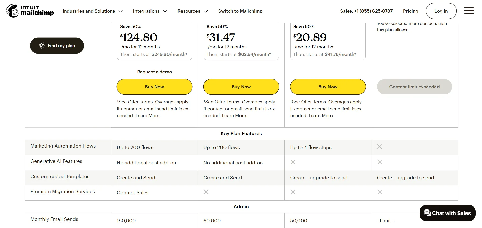
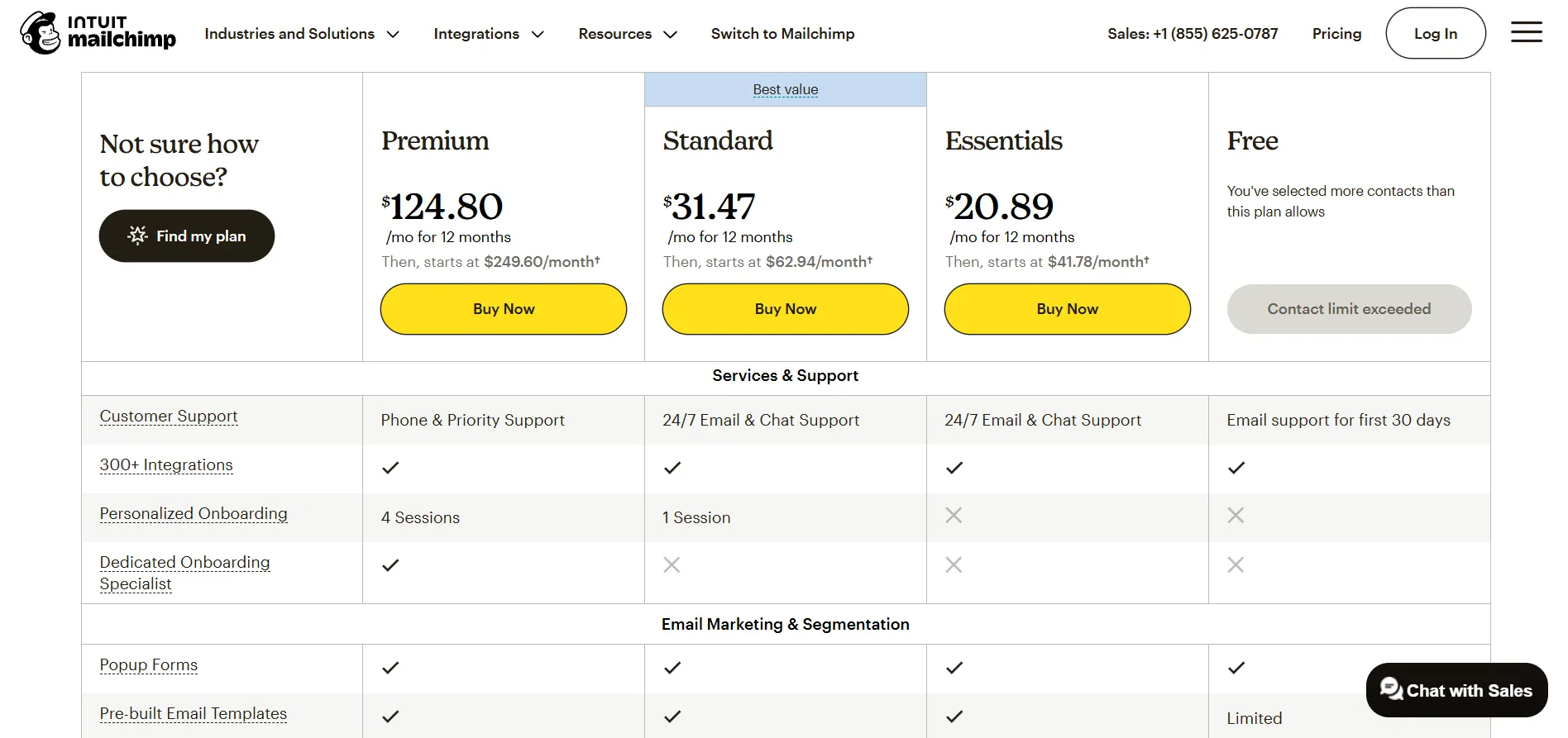
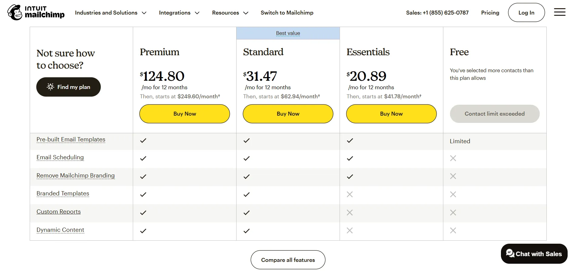
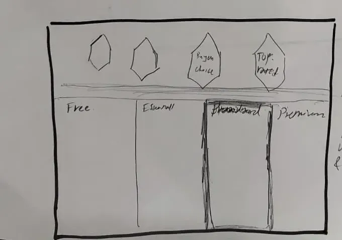
My biggest hurdle was when I wanted to provide the feature list. I was struggling to give skimmers the speed they wanted without leaving skeptics who need every technical detail in the dark. I eventually decided that winning differences must be the only thing visible at first glance, and the rest could be progressively disclosed when users expanded all features.