Spatial Product Design
Most productivity apps feel cramped on a phone and lost on a desktop. With the Vision Pro, I had a literal room to work with. My goal was to port a standard Home and Calendar setup into a spatial environment, focusing on how to keep high-density information legible without overwhelming the user or cluttering the user's actual living room.
Target users are people who want to see their day and tasks at a glance without relying on physical notes or phones. The interface should be easy to read and interact with, but not get in the way.
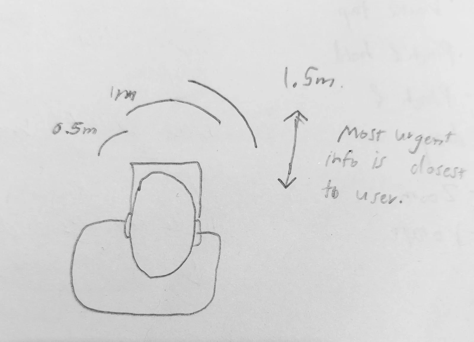
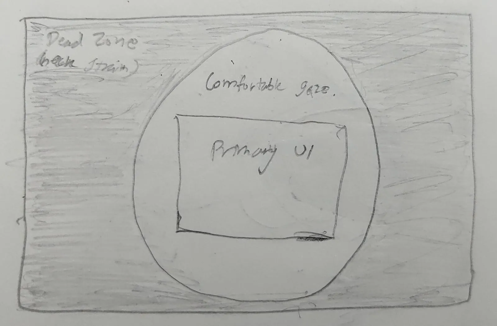
I explored the forward-facing field of view to decide where information should appear around the user. Urgent content is placed closer to the user, while secondary information sits further back. This helps reduce head movement and keeps interaction comfortable over time.
To make the UI clear and easy to use:
I mapped common gestures to task actions:
| Gesture | Action Type | Example |
|---|---|---|
| Tap | Immediate state change | Mark task done, select calendar date |
| Double Tap | Drill down | Expand task to see sub-tasks/notes |
| Pinch & Hold | Secondary action | Open quick menu |
| Pinch & Drag | Move items | Reorder tasks or drag into calendar |
| Zoom | Switch scope | Day → week → month view |
| Rotate | Window angle | Adjust interface to fit user posture |
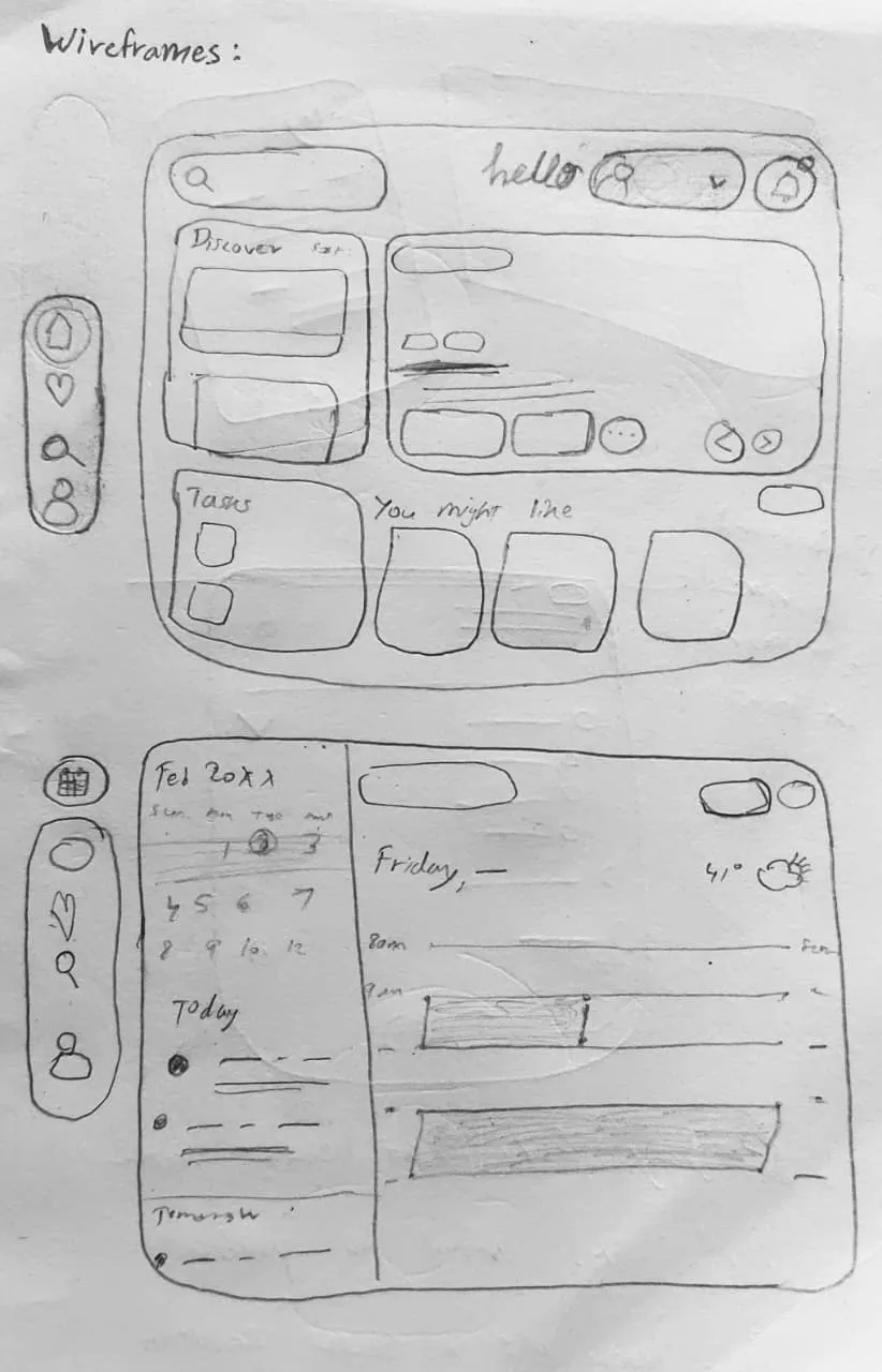
The project started with a wireframe overview to plan the layout for both Home and Calendar screens. This helped establish spacing, depth, and placement of key elements before creating the final UI.
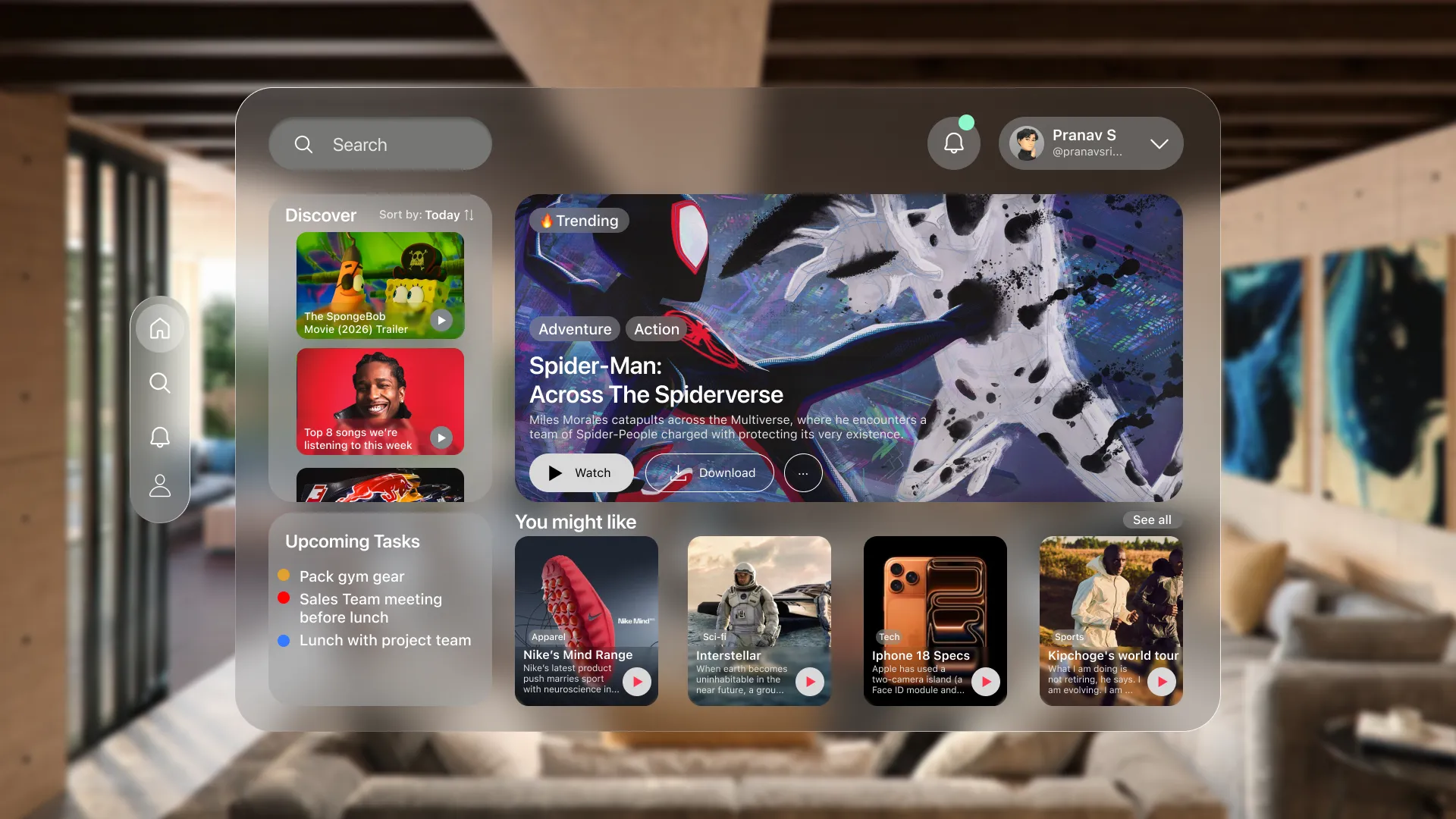
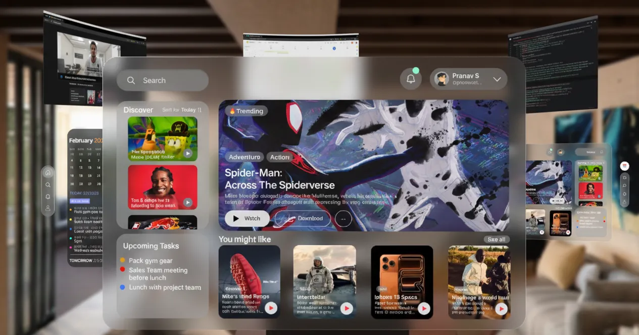
The Home screen shows glanceable tasks alongside recommended articles, what's trending, weather, and discovery content. I wanted the UI to feel like a ghost and is there when you need it, invisible when you don't.
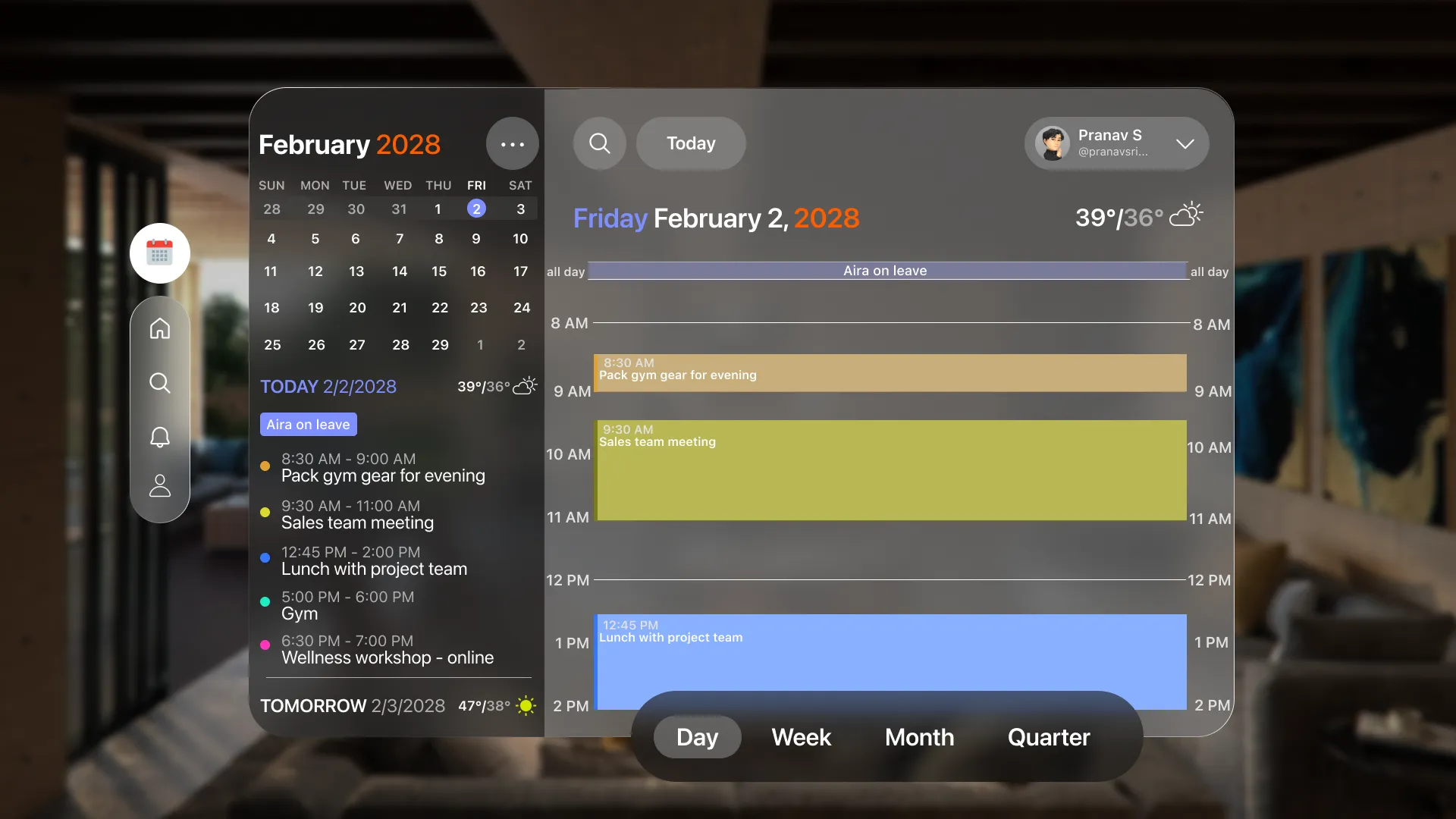
The Calendar screen displays today's tasks along a timeline. The background dims to keep focus on the tasks. Users can switch between day, week, month and quarter view not just by zooming in and out of the calendar but also through the menu at the bottom.
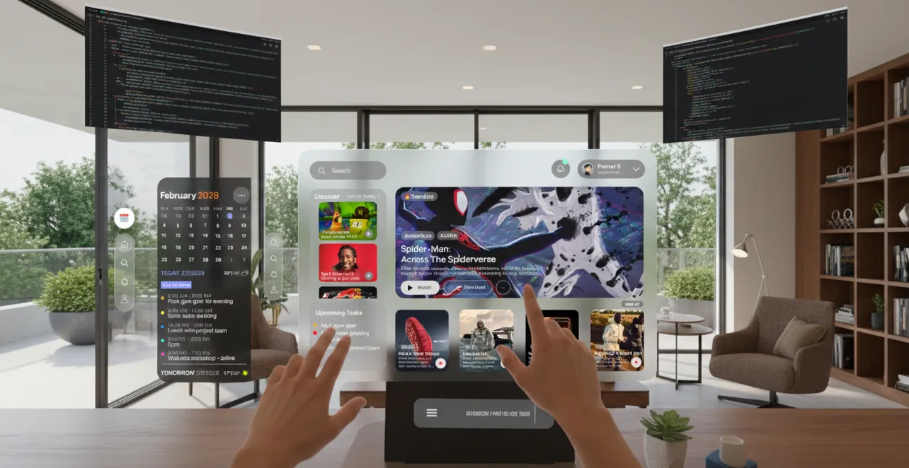
The tasks panel can stay open alongside other apps. Users can check their tasks while interacting with multiple screens. This reduces switching and keeps important information visible in the periphery.