Visual Interface Design
A time-adaptive visual system aligned with human energy and perception.
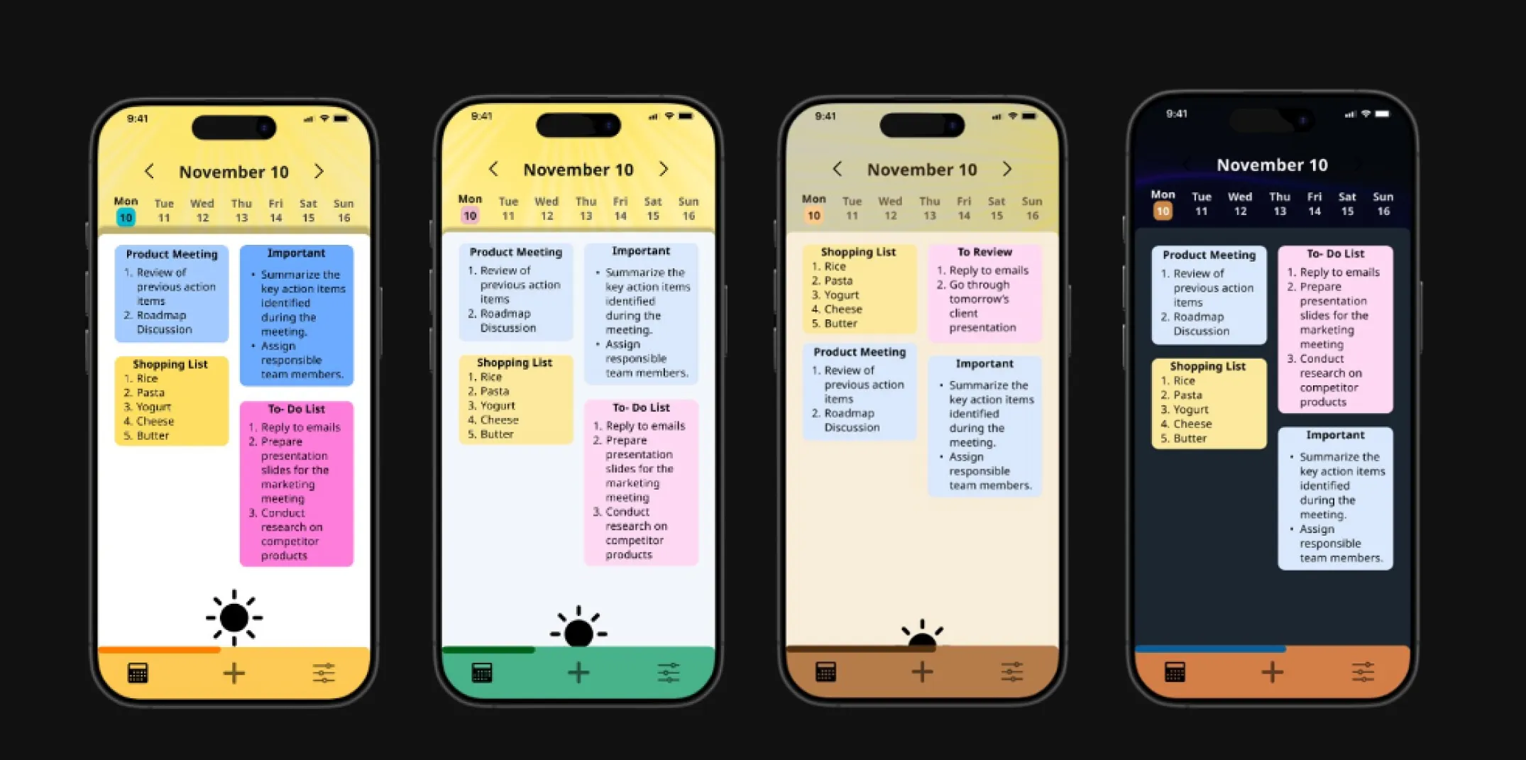
This project explores a circadian-inspired visual design system that adapts color, contrast, and visual
tone across the day. Instead of treating users as static, the system responds to natural shifts in
alertness, focus, and visual sensitivity. The goal was to balance biological inspiration with real-world
UI constraints, proposing a humane, adaptable model suitable for modern digital products.
Digital interfaces ignore the reality of changing human energy states.
Most interfaces remain visually static despite continuous fluctuations in user focus, alertness, and
light sensitivity. This disconnect contributes to eye strain, fatigue, reduced clarity, and poor digital
wellbeing, particularly in productivity-heavy workflows.
How can visual systems respond to circadian rhythms in a way that feels supportive rather than disruptive?
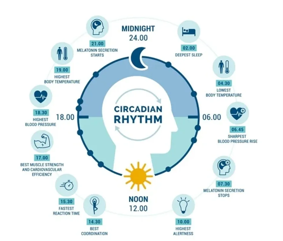
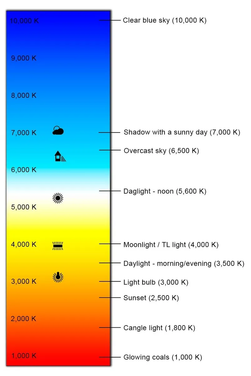
I began by studying how circadian rhythms influence alertness, cognitive readiness, and visual sensitivity
throughout the day, with particular focus on the role of light cues in mood and perception. This led to an
exploration of screen lighting, color temperature, contrast, and their impact on visual strain and readability.
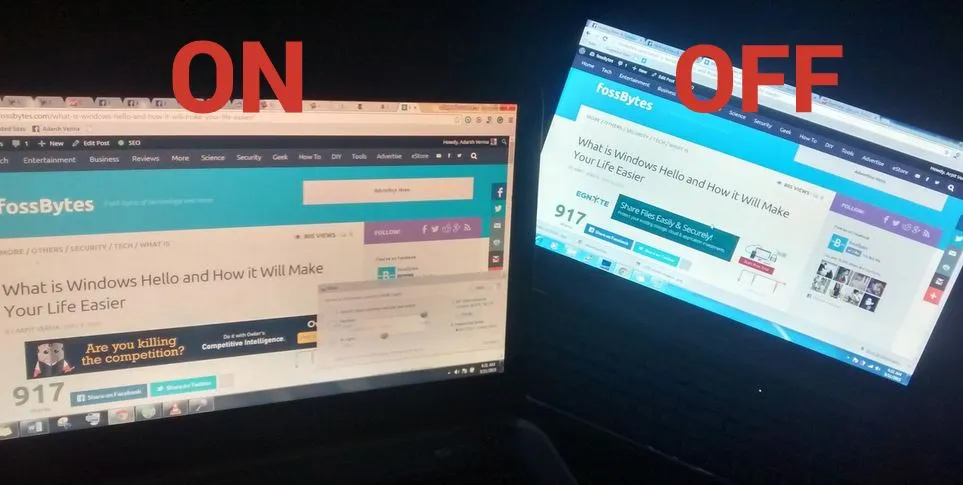
I then analyzed existing adaptive systems such as dark modes, Night Shift, and reader views to understand
current approaches and limitations. Most solutions are binary or system-level: Apple’s dynamic wallpaper is
aesthetic-only, Android’s scheduled dark mode simply switches themes, f.lux adjusts display temperature rather than UI tokens,
and Windows adaptive color prioritizes readability without addressing emotional or biological rhythms.
I then studied established design systems and visual philosophies, drawing
structural clarity from Material Design while learning from real-world lighting cues and soft-shadow
treatments. Time was treated as a first-class design variable, with day phases framed as interface
states that require gradual, predictable transitions. Finally, I examined current display limitations,
recognizing the gap between visual simulation and true biological impact and identifying accessibility and user control
as essential constraints.
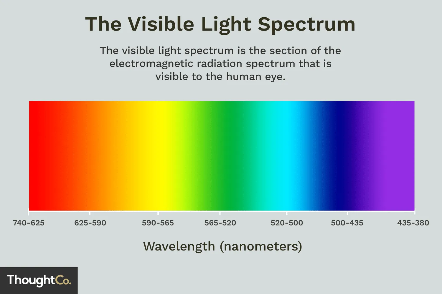
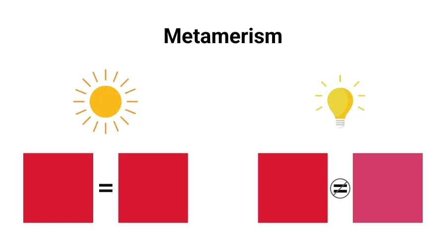
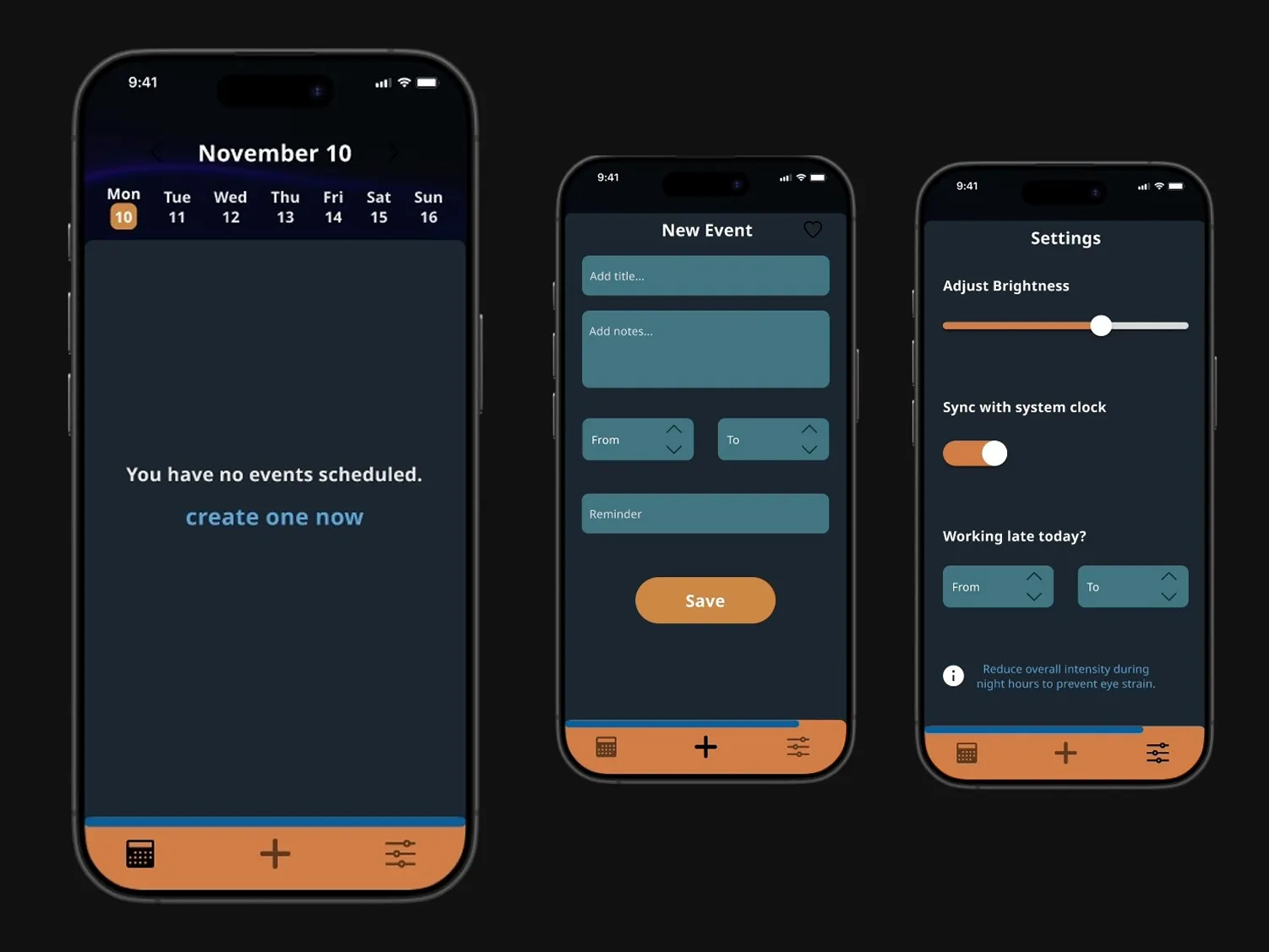
Color acts as a functional signal, not a stylistic layer.
The color system was informed by circadian research and visual perception studies, recognizing that
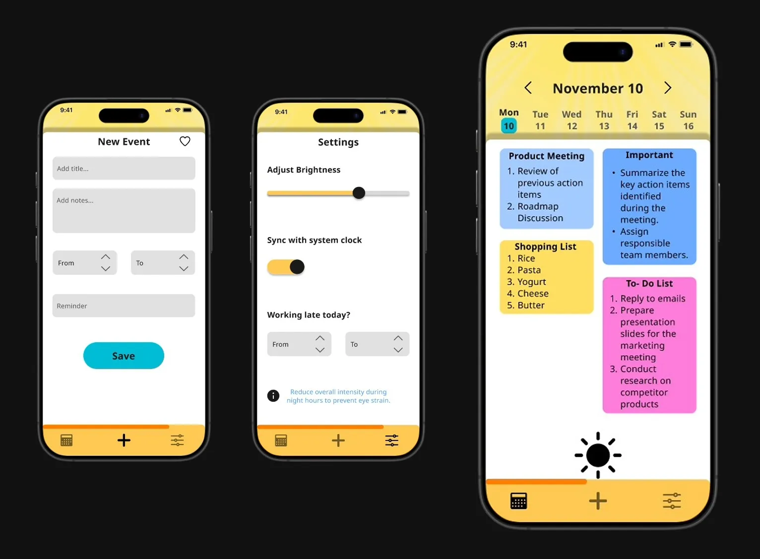
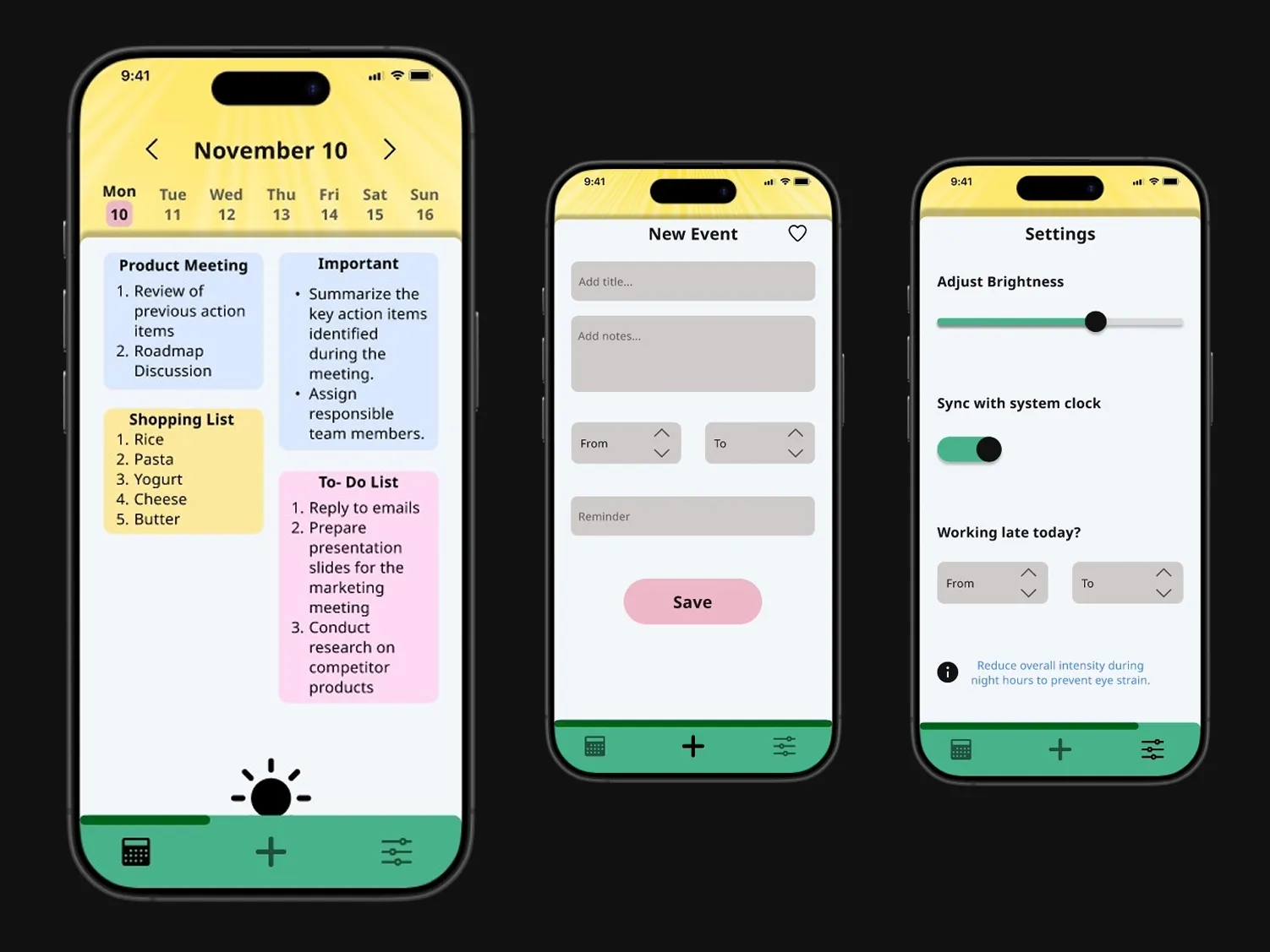
alertness, contrast sensitivity, and comfort shift across the day. Instead of abrupt theme switching,
the palette transitions gradually: cooler, higher-contrast tones in the morning support clarity and
wakefulness; balanced neutrals in the afternoon sustain focus; warmer hues in the evening reduce
cognitive load; and softer, low-luminance tones at night minimize glare and visual strain.
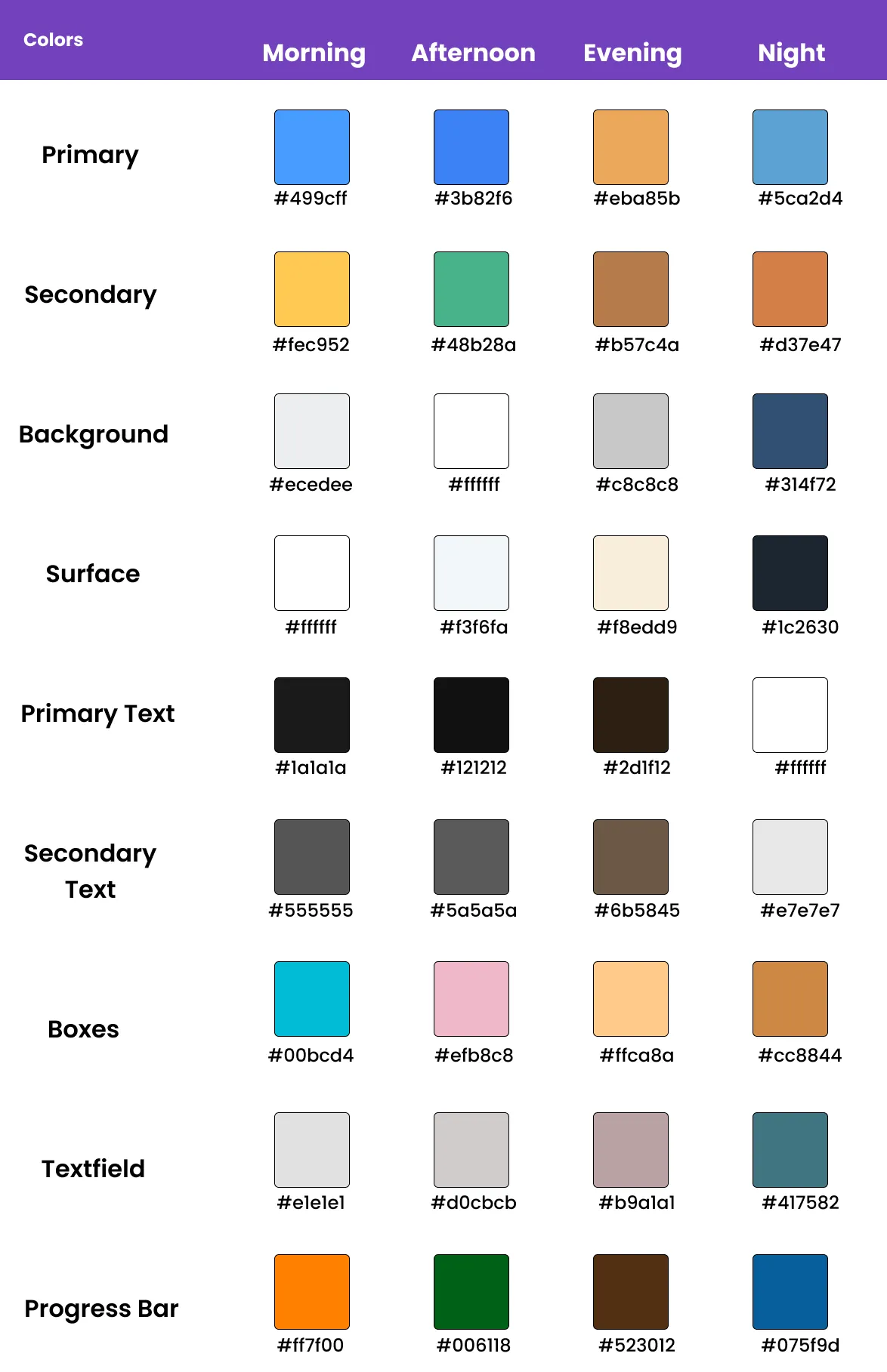
Noto Sans was selected for its clean geometry, wide character set, and strong readability at different sizes and contrast levels; ensuring text remains comfortable to read from morning to night without adding visual fatigue or competing with the adaptive color system.
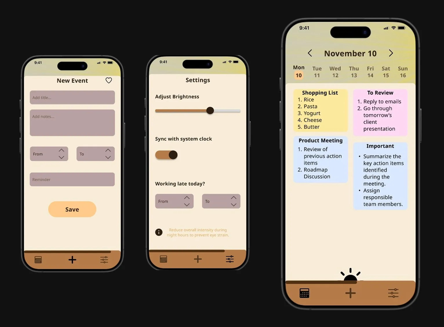
A productivity app exposes circadian design under real usage conditions.
I chose a productivity and to-do app because it is used repeatedly across different times of the day, making
it an ideal context to test time-aware design. Task planning, execution, review, and reflection naturally
happen at different energy levels, so the interface has a real opportunity to support the user’s mental state
rather than distract from it. Unlike purely consumption-based apps, these tools demand sustained focus
and clarity - which makes the impact of circadian-aware visual changes more meaningful and observable.
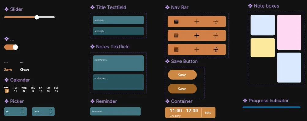
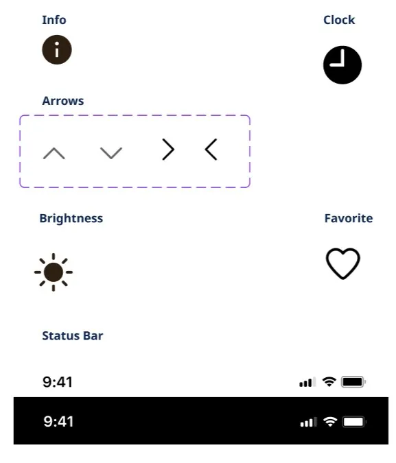
Components stay behaviorally consistent while their visual treatment adapts with time.
From time-aware to context-aware and personalized.
The system could evolve into a more personalized circadian framework, allowing users to calibrate
color intensity, warmth, and transition timing to match their routines and sensitivities. With access
to ambient light, activity type, or focus states, adaptation could respond to real-world conditions
rather than time alone. Advances in display technology could also enable true spectral control.